Theme Documentation
Shortcodes
Click on any shortcode below to show details:
- Row
- Column
- Align Center
- Button
- Read More Button
- FAQ
- List
- Title
- Callout
- Sitemap
- Spacer
- Separator
- Tooltip
- Dropcap
- Highlight
- Clear
- Countdown
- Social List
- Modal Window
- Info Message
- Process Steps
- Pricing Table
- Blog Carousel
- Content Box
- Icon Column
- Icon Feature
- Icon Box
- Icon
- Circle Chart
- Skill
- Testimonial Box
- Testimonial Slider
- Client Carousel
- Gallery Fullwidth
- Image Banner
- Image Frame
- Teaser
- Counter
- Toggle
- Video Embed
- Accordion
- Fullwidth Section
- One Page Section
- Laptop Slider
- Simple Slider
- Gallery Carousel
- Team Member Box
- Team Member Carousel
- Portfolio Fullwidth
- Portfolio Carousel
- Google Map Fullwdith
- Google Map Embedding
Row
[row margin_top="" margin_bottom="" animation="" animation_delay="" class=""]
    Row Content
[/row]
Parameters:
| Name | Value | Description |
|---|---|---|
| margin_bottom | Any number + optional units. Example: 50px |
Enter bottom margin. You can use px, em, %, etc. or enter just number and it will use pixels. |
| margin_top | Any number + optional units. Example: 50px |
Enter top margin. You can use px, em, %, etc. or enter just number and it will use pixels. |
| animation | fade-in, scale-up, right-to-left, left-to-right, top-to-bottom, bottom-to-top, helix, flip-x, flip-y, spin | Select type of animation if you want this element to be animated when it enters into the browsers viewport. Note: Works only in modern browsers. |
| animation_delay | Any number | Enter delay in miliseconds before the animation starts. Useful for creating timed animations. No need to enter ms. |
| class | Any CSS class | If you wish to style particular content element differently, then use this field to add a class name and then refer to it in your css file. |
Column
[column size="col-6" margin_top="" animation="" animation_delay="" class=""]
    Column Content
[/column]
Parameters:
| Name | Value | Description |
|---|---|---|
| size | col-1, col-2, ..., col-12 | col-1 is equal to 1/12 width, while col-12 is equal to 12/12 width. |
| margin_top | Any number + optional units. Example: 50px |
Enter top margin. You can use px, em, %, etc. or enter just number and it will use pixels. |
| animation | fade-in, scale-up, right-to-left, left-to-right, top-to-bottom, bottom-to-top, helix, flip-x, flip-y, spin | Select type of animation if you want this element to be animated when it enters into the browsers viewport. Note: Works only in modern browsers. |
| animation_delay | Any number | Enter delay in miliseconds before the animation starts. Useful for creating timed animations. No need to enter ms. |
| class | Any CSS class | If you wish to style particular content element differently, then use this field to add a class name and then refer to it in your css file. |
Testimonial Box
[testimonial_box type="" count="" columns="" category="" orderby="" order=""
animation="" animation_delay="" class=""]
Parameters:
| Name | Value | Description |
|---|---|---|
| type | normal or large | Choose between a Large or Normal Testimonial Style. |
| count | Any number | Number of items which will appear. To get all items enter -1. |
| columns | 1 or 2 or 3 or 4 | Choose how in many columns are team members displayed. |
| category | category-slug-1, category-slug-2 | Specify which a category to show. Always enter the category slug, and separate them with commas. |
| orderby | Choose from this list | Choose in the order criteria of the items. |
| order | Choose from this list | Choose if the order is Ascending or Descending. |
| animation | fade-in, scale-up, right-to-left, left-to-right, top-to-bottom, bottom-to-top, helix, flip-x, flip-y, spin | Select type of animation if you want this element to be animated when it enters into the browsers viewport. Note: Works only in modern browsers. |
| animation_delay | Any number | Enter delay in miliseconds before the animation starts. Useful for creating timed animations. No need to enter ms |
| class | Any CSS class | If you wish to style particular content element differently, then use this field to add a class name and then refer to it in your css file |
Testimonial Slider
[testimonial_slider type="" count="" animation_speed="" slideshow_speed=""
category="" orderby="" order="" animation="" animation_delay="" class=""]
Parameters:
| Name | Value | Description |
|---|---|---|
| type | normal or large | Choose between a Large or Normal Testimonial Style. |
| animation_speed | Any number | This is the transition time in milliseconds between two testimonials. |
| slideshow_speed | Any number | This is the time in milliseconds an item will be visible before switching to another testimonial. |
| count | Any number | Number of items which will appear. To get all items enter -1. |
| category | category-slug-1, category-slug-2 | Specify which a category to show. Always enter the category slug, and separate them with commas. |
| orderby | Choose from this list | Choose in the order criteria of the items. |
| order | Choose from this list | Choose if the order is Ascending or Descending. |
| animation | fade-in, scale-up, right-to-left, left-to-right, top-to-bottom, bottom-to-top, helix, flip-x, flip-y, spin | Select type of animation if you want this element to be animated when it enters into the browsers viewport. Note: Works only in modern browsers. |
| animation_delay | Any number | Enter delay in miliseconds before the animation starts. Useful for creating timed animations. No need to enter ms |
| class | Any CSS class | If you wish to style particular content element differently, then use this field to add a class name and then refer to it in your css file |
Info Message
[info_message style="" animation="" animation_delay="" class=""]
    Info Message Content
[/info_message]
Parameters:
| Name | Value | Description |
|---|---|---|
| style | info or warning or success or error | Choose the style for this message. Each has its own feel. |
| animation | fade-in, scale-up, right-to-left, left-to-right, top-to-bottom, bottom-to-top, helix, flip-x, flip-y, spin | Select type of animation if you want this element to be animated when it enters into the browsers viewport. Note: Works only in modern browsers. |
| animation_delay | Any number | Enter delay in miliseconds before the animation starts. Useful for creating timed animations. No need to enter ms |
| class | Any CSS class | If you wish to style particular content element differently, then use this field to add a class name and then refer to it in your css file |
Sitemap
[sitemap depth="" class=""]
Parameters:
| Name | Value | Description |
|---|---|---|
| depth | Any number. Example: 2 | Specify how many child levels to show. Leave empty for default value. |
| class | Any CSS class | If you wish to style particular content element differently, then use this field to add a class name and then refer to it in your css file. |
Social List
[social_icons size="" style="" new_tab="" animation="" animation_delay="" class="" twitter="" facebook="" skype="" instagram="" pinterest="" google_plus="" dribbble="" soundcloud="" youtube="" vimeo="" flickr="" tumblr="" yahoo="" foursquare="" blogger="" wordpress="" lastfm="" github="" linkedin="" yelp="" forrst="" deviantart="" stumbleupon="" delicious="" reddit="" xing="" envelop="" feed_2="" custom_url=""]
Parameters:
| Name | Value | Description |
|---|---|---|
| size | small or large | Select size of these social icons. |
| style | dark or light | Select a style for these social icons. |
| new_tab | yes or no | Open the social links in new tab. |
| animation | fade-in, scale-up, right-to-left, left-to-right, top-to-bottom, bottom-to-top, helix, flip-x, flip-y, spin | Select type of animation if you want this element to be animated when it enters into the browsers viewport. Note: Works only in modern browsers. |
| animation_delay | Any number | Enter delay in miliseconds before the animation starts. Useful for creating timed animations. No need to enter ms. |
| class | Any CSS class | If you wish to style particular content element differently, then use this field to add a class name and then refer to it in your css file. |
| social_network_name | Link to social network |
Title
[title type="" color="" animation="" animation_delay="" class=""]
    Title goes here
[/title]
Parameters:
| Name | Value | Description |
|---|---|---|
| type | extra-large, h1, h2, h3, h4, h5, h6, special-h3, special-h3-left, special-h3-right, special-h4, special-h4-left, special-h4-right, fancy-h1, fancy-h2, fancy-h3, fancy-h4, fancy-h5, fancy-h6, subtitle-h3, subtitle-h6, special-h6 | Choose your title heading style. |
| color | #FF0000 | Choose a color in hex format for this element. |
| animation | fade-in, scale-up, right-to-left, left-to-right, top-to-bottom, bottom-to-top, helix, flip-x, flip-y, spin | Select type of animation if you want this element to be animated when it enters into the browsers viewport. Note: Works only in modern browsers. |
| animation_delay | Any number | Enter delay in miliseconds before the animation starts. Useful for creating timed animations. No need to enter ms. |
| class | Any CSS class | If you wish to style particular content element differently, then use this field to add a class name and then refer to it in your css file. |
Spacer
[spacer height="" class=""]
Parameters:
| Name | Value | Description |
|---|---|---|
| height | Any number. Example: 40 | Enter the height of this spacer. You can use px, em, %, etc. or enter just number and it will use pixels. |
| class | Any CSS class | If you wish to style particular content element differently, then use this field to add a class name and then refer to it in your css file. |
Tooltip
[tooltip text="" position="" class=""]
Parameters:
| Name | Value | Description |
|---|---|---|
| text | Any string | Enter a plain text which will be shown in the tooltip on hover. |
| position | top or right or bottom or left | Choose position for your tooltip. |
| class | Any CSS class | If you wish to style particular content element differently, then use this field to add a class name and then refer to it in your css file. |
Dropcap
[dropcap style="" class=""]D[/dropcap]ropcap
Parameters:
| Name | Value | Description |
|---|---|---|
| style | default or simple or fancy or dark | Select style for the dropcap. |
| class | Any CSS class | If you wish to style particular content element differently, then use this field to add a class name and then refer to it in your css file. |
Separator
[separator type="" scissors_icon="" go_to_top="" margin_top="" margin_bottom="" animation="" animation_delay="" class=""]
Parameters:
| Name | Value | Description |
|---|---|---|
| type | default or small-break or default-double or dashed or dashed-double or small or hb-fw-separator or hb-fw-dashed | Choose your separator style. * Fullwidth Separator does not support all of the options and it has to be used in fullwidth layout. |
| scissors_icon | yes or no | Enable Scissors icon on the separator. |
| go_to_top | yes or no | Enable Go To Top icon on the separator which links to the beginning of the page. |
| margin_bottom | Any number + optional units. Example: 50px |
Enter bottom margin. You can use px, em, %, etc. or enter just number and it will use pixels. |
| margin_top | Any number + optional units. Example: 50px |
Enter top margin. You can use px, em, %, etc. or enter just number and it will use pixels. |
| animation | fade-in, scale-up, right-to-left, left-to-right, top-to-bottom, bottom-to-top, helix, flip-x, flip-y, spin | Select type of animation if you want this element to be animated when it enters into the browsers viewport. Note: Works only in modern browsers. |
| animation_delay | Any number | Enter delay in miliseconds before the animation starts. Useful for creating timed animations. No need to enter ms. |
| class | Any CSS class | If you wish to style particular content element differently, then use this field to add a class name and then refer to it in your css file. |
Highlight
[highlight style="" class=""]Highlight Content[/highlight]
Parameters:
| Name | Value | Description |
|---|---|---|
| style | default or alt | Select style for the text highlight. |
| class | Any CSS class | If you wish to style particular content element differently, then use this field to add a class name and then refer to it in your css file. |
Modal Window
[modal_window title="" invoke_title="" id="" show_on_load=""]
    Modal Window Content
[/modal_window]
Parameters:
| Name | Value | Description |
|---|---|---|
| title | Any string. Example: My Window | Enter a title for this modal window. |
| invoke_title | Any string. Example: Show Modal | Enter a title for the invoke button for this modal window. |
| id | Any sanitized string. Example: my-modal-window | Enter a UNIQUE id word, without spaces, that will be assigned to this modal window. You can use this id to invoke the window with javascript if you don't want to show the invoke button. |
| show_on_load | yes or no | Choose whether to show the modal window on page load. |
Button
[button icon="" special_style="" color="" size="" three_d="" title="" link=""
new_tab="" animation="" animation_delay="" class=""]
Parameters:
| Name | Value | Description |
|---|---|---|
| title | Any string | Choose the Button Title. |
| link | Any URL | Choose the Button Link. |
| icon | hb-moon-brain | Enter a name of the icon you would like to use. Leave empty if you don't want an icon. You can find list of icons here: Icon List. |
| new_tab | yes or no | Open the button link in a new tab. |
| special_style | yes or no | Get additional special style on the button. |
| three_d | yes or no | Get 3D style on the button. |
| color | default, turqoise, green-sea, sunflower, orange, emerald, nephritis, carrot, pumpkin, peter-river, belize, alizarin, pomegranate, amethyst, wisteria, wet-asphalt, midnight-blue, concrete, asbestos, darkly, second-light, hb-third-light, second-dark, third-dark, yellow | Choose the button color. |
| size | small or default or large | Choose the button size. |
| animation | fade-in, scale-up, right-to-left, left-to-right, top-to-bottom, bottom-to-top, helix, flip-x, flip-y, spin | Select type of animation if you want this element to be animated when it enters into the browsers viewport. Note: Works only in modern browsers. |
| animation_delay | Any number | Enter delay in miliseconds before the animation starts. Useful for creating timed animations. No need to enter ms |
| class | Any CSS class | If you wish to style particular content element differently, then use this field to add a class name and then refer to it in your css file |
Callout
[callout title="" link="" new_tab="" icon="" animation="" animation_delay=""
class=""]
    Callout Content Here
[/callout]
Parameters:
| Name | Value | Description |
|---|---|---|
| title | Any string | Choose the Button Title. |
| link | Any URL | Choose the Button Link. |
| icon | hb-moon-brain | Enter a name of the icon you would like to use. Leave empty if you don't want an icon. You can find list of icons here: Icon List. |
| new_tab | yes or no | Open the button link in a new tab. |
| animation | fade-in, scale-up, right-to-left, left-to-right, top-to-bottom, bottom-to-top, helix, flip-x, flip-y, spin | Select type of animation if you want this element to be animated when it enters into the browsers viewport. Note: Works only in modern browsers. |
| animation_delay | Any number | Enter delay in miliseconds before the animation starts. Useful for creating timed animations. No need to enter ms |
| class | Any CSS class | If you wish to style particular content element differently, then use this field to add a class name and then refer to it in your css file |
Countdown
[countdown date="" aligncenter="" animation="" animation_delay="" class=""]
Parameters:
| Name | Value | Description |
|---|---|---|
| date | Date in this format: 27 february 2014 12:00:00 |
Enter date and time for which countdown will count down to. |
| aligncenter | yes or no | Align this counter to the center. |
| animation | fade-in, scale-up, right-to-left, left-to-right, top-to-bottom, bottom-to-top, helix, flip-x, flip-y, spin | Select type of animation if you want this element to be animated when it enters into the browsers viewport. Note: Works only in modern browsers. |
| animation_delay | Any number | Enter delay in miliseconds before the animation starts. Useful for creating timed animations. No need to enter ms |
| class | Any CSS class | If you wish to style particular content element differently, then use this field to add a class name and then refer to it in your css file |
Read More Button
[read_more title="" link="" new_tab="" animation="" animation_delay="" class=""]
Parameters:
| Name | Value | Description |
|---|---|---|
| title | Any string | Choose the Button Title. |
| link | Any URL | Choose the Button Link. |
| new_tab | yes or no | Open the button link in a new tab. |
| animation | fade-in, scale-up, right-to-left, left-to-right, top-to-bottom, bottom-to-top, helix, flip-x, flip-y, spin | Select type of animation if you want this element to be animated when it enters into the browsers viewport. Note: Works only in modern browsers. |
| animation_delay | Any number | Enter delay in miliseconds before the animation starts. Useful for creating timed animations. No need to enter ms |
| class | Any CSS class | If you wish to style particular content element differently, then use this field to add a class name and then refer to it in your css file |
Team Member Box
[team_member_box style="" count="" columns="" category="" excerpt_length=""
orderby="" order="" animation="" animation_delay="" class=""]
Parameters:
| Name | Value | Description |
|---|---|---|
| style | normal or boxed | Choose between a Large or Boxed Team Member Style. |
| count | Any number | Number of items which will appear. To get all items enter -1. |
| columns | 1 or 2 or 3 or 4 | Choose how in many columns are team members displayed. |
| category | category-slug-1, category-slug-2 | Specify which a category to show. Always enter the category slug, and separate them with commas. |
| excerpt_length | Any number | Specify how many words will show in the post excerpt. |
| orderby | Choose from this list | Choose in the order criteria of the items. |
| order | Choose from this list | Choose if the order is Ascending or Descending. |
| animation | fade-in, scale-up, right-to-left, left-to-right, top-to-bottom, bottom-to-top, helix, flip-x, flip-y, spin | Select type of animation if you want this element to be animated when it enters into the browsers viewport. Note: Works only in modern browsers. |
| animation_delay | Any number | Enter delay in miliseconds before the animation starts. Useful for creating timed animations. No need to enter ms |
| class | Any CSS class | If you wish to style particular content element differently, then use this field to add a class name and then refer to it in your css file |
Circle Chart
[circle_chart type="" color="" percent="" icon="" text="" caption="" size=""
weight="" track_color="" animation_speed="" animation="" animation_delay=""
class=""]
Parameters:
| Name | Value | Description |
|---|---|---|
| type | with-icon or with-percent or with-text | Select the type of the circle chart. It will define what is displayed inside the circle. |
| color | #FF0000 | Choose the icon color in hex format. Leave empty for default value. |
| percent | Any number between 0 and 100 | Only for selected with-percent type. Enter a percent number here. Do not enter % character, just number. |
| text | Any string | Only for selected with-text type, the text that goes inside the circle chart. |
| icon | hb-moon-brain | Only for selected with-icon type. Enter a name of the icon you would like to use. Leave empty if you don't want an icon. You can find list of icons here: Icon List. |
| caption | Any string | Optional chart caption. Showed below the chart. |
| size | Any number. Exampe: 200. | Enter chart size value. |
| weight | Any number. Exampe: 4. | Enter chart weight value. |
| track_color | #FF0000 | Choose color in hex format. |
| animation_speed | Any number | Enter chart animation speed. Useful for creating timed animations. No need to enter ms. |
| animation | fade-in, scale-up, right-to-left, left-to-right, top-to-bottom, bottom-to-top, helix, flip-x, flip-y, spin | Select type of animation if you want this element to be animated when it enters into the browsers viewport. Note: Works only in modern browsers. |
| animation_delay | Any number | Enter delay in miliseconds before the animation starts. Useful for creating timed animations. No need to enter ms. |
| class | Any CSS class | If you wish to style particular content element differently, then use this field to add a class name and then refer to it in your css file. |
Laptop Slider
[laptop_slider speed="" bullets="" images="" animation="" animation_delay=""
class=""]
    [slider_item img="" title="" rel=""]
    [slider_item img="" title="" rel=""]
    [slider_item img="" title="" rel=""]
[/laptop_slider]
Parameters for [laptop_slider]:
| Name | Value | Description |
|---|---|---|
| speed | Any number | Speed in miliseconds before slides are changed. |
| bullets | yes or no | Choose whether to display the bullet navigation on the slider. |
| images | 10, 11, 12 | Enter IDs of the images located in the media library. If you have [slider_item] shortcodes in the content, then leave this atribute empty. |
| animation | fade-in, scale-up, right-to-left, left-to-right, top-to-bottom, bottom-to-top, helix, flip-x, flip-y, spin | Select type of animation if you want this element to be animated when it enters into the browsers viewport. Note: Works only in modern browsers. |
| animation_delay | Any number | Enter delay in miliseconds before the animation starts. Useful for creating timed animations. No need to enter ms |
| class | Any CSS class | If you wish to style particular content element differently, then use this field to add a class name and then refer to it in your css file |
Parameters for [slider_item]:
| Name | Value | Description |
|---|---|---|
| img | URL to image | Enter the URL of the image for this slide. |
| title | Any string | Specify and display a title on this slider item. |
| rel | my-lightbox | If you want to open this image in lightbox gallery along with other images, then enter the same REL for all those images. |
Simple Slider
[simple_slider speed="" pause_on_hover="" bullets="" border="" arrows=""
images="" animation="" animation_delay="" class=""]
    [simple_slide img="" title="" subtitle="" lightbox="" rel=""]
    [simple_slide img="" title="" subtitle="" lightbox="" rel=""]
    [simple_slide img="" title="" subtitle="" lightbox="" rel=""]
[/laptop_slider]
Parameters for [simple_slider]:
| Name | Value | Description |
|---|---|---|
| speed | Any number | Speed in miliseconds before slides are changed. |
| pause_on_hover | yes or no | Choose whether to pause the slider on hover. |
| bullets | yes or no | Choose whether to display the bullet navigation on the slider. |
| arrows | yes or no | Choose whether to display the arrow navigation on the slider. |
| border | yes or no | Choose whether to display a white border around the slider. |
| images | 10, 11, 12 | Enter IDs of the images located in the media library. If you have [simple_slide] shortcodes in the content, then leave this atribute empty. |
| animation | fade-in, scale-up, right-to-left, left-to-right, top-to-bottom, bottom-to-top, helix, flip-x, flip-y, spin | Select type of animation if you want this element to be animated when it enters into the browsers viewport. Note: Works only in modern browsers. |
| animation_delay | Any number | Enter delay in miliseconds before the animation starts. Useful for creating timed animations. No need to enter ms |
| class | Any CSS class | If you wish to style particular content element differently, then use this field to add a class name and then refer to it in your css file |
Parameters for [simple_slide]:
| Name | Value | Description |
|---|---|---|
| img | URL to image | Enter the URL of the image for this slide. |
| title | Any string | Specify and display a title on this slider item. |
| subtitle | Any string | Specify and display a subtitle on this slider item. |
| lightbox | yes or no | Choose whether to open images on click in a lightbox. |
| rel | my-lightbox | If you want to open this image in lightbox gallery along with other images, then enter the same REL for all those images. |
Fullwidth Section
[fullwidth_section id="" background_type="" border="" text_color="" bg_color="" image="" parallax="" scissors_icon="" bg_video_mp4="" bg_video_ogv=""
 bg_video_poster="" overlay="" margin_top="" margin_bottom="" class=""
 padding_top="" padding_bottom=""]
    Fullwidth Section Content Here
[/fullwidth_section]
Parameters for [simple_slider]:
| Name | Value | Description |
|---|---|---|
| id | Any sanitized string. In this format: about-us | If needed, enter a UNIQUE section id, without whitespaces. You can use that id to make links to this section. |
| background_type | color or image or texture or video | Select a background type for this element. Filling in other parameters depend largely on the choice of the background_type. |
| border | yes or no | Choose whether to show a border on your fullwidth section. |
| text_color | light or dark | Select a text color style for this element. Use light when your background is dark and opposite. |
| bg_color | #FF0000 | Choose background color in hex format. Fill in only if background type is set to color. |
| image | ID or URL of Image | Enter URL of the image for the background, or enter ID of an image from the media library. Fill in only if background type is set to image or texture. |
| parallax | yes or no | Enable Parallax effect for image. |
| scissors_icon | yes or no | Enable Scissors icon on the top left of the fullwidth section. |
| bg_video_mp4 | URL to Video | Enter URL to your video in MP4 format. Fill in only if background type is set to video. |
| bg_video_ogv | URL to Video | Enter URL to your video in OGV format. Fill in only if background type is set to video. |
| poster | URL or ID of Image | Image that will be used as a placeholder until video is loaded (or cannot be loaded). Enter URL of the image for the background, or enter ID of an image from the media library. Fill in only if background type is set to video. |
| overlay | yes or no | Display a texture overlay over the video. Fill in only if background type is set to video. |
| margin_bottom | Any number + optional units. Example: 50px |
Enter bottom margin. You can use px, em, %, etc. or enter just number and it will use pixels. |
| margin_top | Any number + optional units. Example: 50px |
Enter top margin. You can use px, em, %, etc. or enter just number and it will use pixels. |
| padding_bottom | Any number + optional units. Example: 50px |
Enter bottom padding. You can use px, em, %, etc. or enter just number and it will use pixels. |
| padding_top | Any number + optional units. Example: 50px |
Enter top padding. You can use px, em, %, etc. or enter just number and it will use pixels. |
| class | Any CSS class | If you wish to style particular content element differently, then use this field to add a class name and then refer to it in your css file |
One Page Section
[onepage_section id="" background_type="" border="" text_color="" bg_color=""
image="" parallax="" scissors_icon="" bg_video_mp4="" bg_video_ogv=""
bg_video_poster="" overlay="" margin_top="" margin_bottom="" class=""
padding_top="" padding_bottom="" name=""]
    One Page Section Content Here
[/onepage_section]
Parameters for [simple_slider]:
| Name | Value | Description |
|---|---|---|
| id | Any sanitized string. In this format: about-us | If needed, enter a UNIQUE section id, without whitespaces. You can use that id to make links to this section. |
| name | Any string | Enter title for this section. It will be used in left circle navigation on one page websites. |
| background_type | color or image or texture or video | Select a background type for this element. Filling in other parameters depend largely on the choice of the background_type. |
| border | yes or no | Choose whether to show a border on your fullwidth section. |
| text_color | light or dark | Select a text color style for this element. Use light when your background is dark and opposite. |
| bg_color | #FF0000 | Choose background color in hex format. Fill in only if background type is set to color. |
| image | ID or URL of Image | Enter URL of the image for the background, or enter ID of an image from the media library. Fill in only if background type is set to image or texture. |
| parallax | yes or no | Enable Parallax effect for image. |
| scissors_icon | yes or no | Enable Scissors icon on the top left of the fullwidth section. |
| bg_video_mp4 | URL to Video | Enter URL to your video in MP4 format. Fill in only if background type is set to video. |
| bg_video_ogv | URL to Video | Enter URL to your video in OGV format. Fill in only if background type is set to video. |
| poster | URL or ID of Image | Image that will be used as a placeholder until video is loaded (or cannot be loaded). Enter URL of the image for the background, or enter ID of an image from the media library. Fill in only if background type is set to video. |
| overlay | yes or no | Display a texture overlay over the video. Fill in only if background type is set to video. |
| margin_bottom | Any number + optional units. Example: 50px |
Enter bottom margin. You can use px, em, %, etc. or enter just number and it will use pixels. |
| margin_top | Any number + optional units. Example: 50px |
Enter top margin. You can use px, em, %, etc. or enter just number and it will use pixels. |
| padding_bottom | Any number + optional units. Example: 50px |
Enter bottom padding. You can use px, em, %, etc. or enter just number and it will use pixels. |
| padding_top | Any number + optional units. Example: 50px |
Enter top padding. You can use px, em, %, etc. or enter just number and it will use pixels. |
| class | Any CSS class | If you wish to style particular content element differently, then use this field to add a class name and then refer to it in your css file |
Team Member Carousel
[team_member_carousel style="" total_items="" visible_items=""
category="" excerpt_length="" auto_rotate="" carousel_speed=""
orderby="" order="" animation="" animation_delay="" class=""]
Parameters:
| Name | Value | Description |
|---|---|---|
| style | normal or boxed | Choose between a Large or Boxed Team Member Style. |
| visible_items | 2 or 3 or 4 or 5 or 6 or 7 or 8 | Choose how many posts are visible at a time. This number also specifies how many columns are displayed. |
| total_items | Any number | Choose how many posts to include in the carousel. To get all items enter -1. |
| category | category-slug-1, category-slug-2 | Specify which a category to show. Always enter the category slug, and separate them with commas. |
| excerpt_length | Any number | Specify how many words will show in the post excerpt. |
| carousel_speed | Any number | Specify the carousel speed in miliseconds. |
| auto_rotate | yes or no | Start carousel automatically. |
| orderby | Choose from this list | Choose in the order criteria of the items. |
| order | Choose from this list | Choose if the order is Ascending or Descending. |
| animation | fade-in, scale-up, right-to-left, left-to-right, top-to-bottom, bottom-to-top, helix, flip-x, flip-y, spin | Select type of animation if you want this element to be animated when it enters into the browsers viewport. Note: Works only in modern browsers. |
| animation_delay | Any number | Enter delay in miliseconds before the animation starts. Useful for creating timed animations. No need to enter ms |
| class | Any CSS class | If you wish to style particular content element differently, then use this field to add a class name and then refer to it in your css file |
Gallery Carousel
[gallery_carousel style="" total_items="" visible_items=""
category="" auto_rotate="" carousel_speed="" orderby=""
order="" animation="" animation_delay="" class=""]
Parameters:
| Name | Value | Description |
|---|---|---|
| style | standard or modern | Choose between a standard or modern gallery style. |
| visible_items | 2 or 3 or 4 or 5 or 6 or 7 or 8 | Choose how many posts are visible at a time. This number also specifies how many columns are displayed. |
| total_items | Any number | Choose how many posts to include in the carousel. To get all items enter -1. |
| category | category-slug-1, category-slug-2 | Specify which a category to show. Always enter the category slug, and separate them with commas. |
| carousel_speed | Any number | Specify the carousel speed in miliseconds. |
| auto_rotate | yes or no | Start carousel automatically. |
| orderby | Choose from this list | Choose in the order criteria of the items. |
| order | Choose from this list | Choose if the order is Ascending or Descending. |
| animation | fade-in, scale-up, right-to-left, left-to-right, top-to-bottom, bottom-to-top, helix, flip-x, flip-y, spin | Select type of animation if you want this element to be animated when it enters into the browsers viewport. Note: Works only in modern browsers. |
| animation_delay | Any number | Enter delay in miliseconds before the animation starts. Useful for creating timed animations. No need to enter ms |
| class | Any CSS class | If you wish to style particular content element differently, then use this field to add a class name and then refer to it in your css file |
Portfolio Carousel
[portfolio_carousel style="" total_items="" visible_items=""
category="" auto_rotate="" carousel_speed="" orderby=""
order="" animation="" animation_delay="" class=""]
Parameters:
| Name | Value | Description |
|---|---|---|
| style | standard or descriptive | Choose between a standard or descriptive portfolio style. |
| visible_items | 2 or 3 or 4 or 5 or 6 or 7 or 8 | Choose how many posts are visible at a time. This number also specifies how many columns are displayed. |
| total_items | Any number | Choose how many posts to include in the carousel. To get all items enter -1. |
| category | category-slug-1, category-slug-2 | Specify which a category to show. Always enter the category slug, and separate them with commas. |
| carousel_speed | Any number | Specify the carousel speed in miliseconds. |
| auto_rotate | yes or no | Start carousel automatically. |
| orderby | Choose from this list | Choose in the order criteria of the items. |
| order | Choose from this list | Choose if the order is Ascending or Descending. |
| animation | fade-in, scale-up, right-to-left, left-to-right, top-to-bottom, bottom-to-top, helix, flip-x, flip-y, spin | Select type of animation if you want this element to be animated when it enters into the browsers viewport. Note: Works only in modern browsers. |
| animation_delay | Any number | Enter delay in miliseconds before the animation starts. Useful for creating timed animations. No need to enter ms |
| class | Any CSS class | If you wish to style particular content element differently, then use this field to add a class name and then refer to it in your css file |
Image Banner
[image_banner url="" text_color="" animation="" animation_delay="" class=""]
    Image Banner Content
[/image_banner]
Parameters:
| Name | Value | Description |
|---|---|---|
| url | URL to Image | Specify image for this element. The dimensions of a banner depends on your image size. |
| text_color | light or dark | Choose your text color style. |
| animation | fade-in, scale-up, right-to-left, left-to-right, top-to-bottom, bottom-to-top, helix, flip-x, flip-y, spin | Select type of animation if you want this element to be animated when it enters into the browsers viewport. Note: Works only in modern browsers. |
| animation_delay | Any number | Enter delay in miliseconds before the animation starts. Useful for creating timed animations. No need to enter ms. |
| class | Any CSS class | If you wish to style particular content element differently, then use this field to add a class name and then refer to it in your css file. |
Image Frame
[image_frame url="" border_style="" action="" link="" rel="" animation=""
animation_delay="" class=""]
Parameters:
| Name | Value | Description |
|---|---|---|
| url | URL to Image | Specify image for this element. The dimensions of a frame depends on your image size. |
| border_style | no-frame or circle-frame or boxed-frame or boxed-frame-hover | Choose the style of the image border. |
| action | none or open-url or open-lightbox | Choose what to do when clicked on the image. |
| link | URL of choice | Enter URL where it will lead when clicked on the image. On Click Action has to be "open-url". You need to enter full website address with http:// prefix. |
| rel | my-lightbox | If you want to open this image in lightbox gallery along with other images, then enter the same Gallery REL for all those images. |
| animation | fade-in, scale-up, right-to-left, left-to-right, top-to-bottom, bottom-to-top, helix, flip-x, flip-y, spin | Select type of animation if you want this element to be animated when it enters into the browsers viewport. Note: Works only in modern browsers. |
| animation_delay | Any number | Enter delay in miliseconds before the animation starts. Useful for creating timed animations. No need to enter ms. |
| class | Any CSS class | If you wish to style particular content element differently, then use this field to add a class name and then refer to it in your css file. |
Client Carousel
[client_carousel style="" total_items="" visible_items="" category=""
auto_rotate="" carousel_speed="" orderby="" order="" animation=""
animation_delay="" class=""]
Parameters:
| Name | Value | Description |
|---|---|---|
| style | simple or focus or greyscale or simple-white | Choose how the client logos are styled. |
| visible_items | 2 or 3 or 4 or 5 or 6 or 7 or 8 | Choose how many posts are visible at a time. This number also specifies how many columns are displayed. |
| total_items | Any number | Choose how many posts to include in the carousel. To get all items enter -1. |
| category | category-slug-1, category-slug-2 | Specify which a category to show. Always enter the category slug, and separate them with commas. |
| carousel_speed | Any number | Specify the carousel speed in miliseconds. |
| auto_rotate | yes or no | Start carousel automatically. |
| orderby | Choose from this list | Choose in the order criteria of the items. |
| order | Choose from this list | Choose if the order is Ascending or Descending. |
| animation | fade-in, scale-up, right-to-left, left-to-right, top-to-bottom, bottom-to-top, helix, flip-x, flip-y, spin | Select type of animation if you want this element to be animated when it enters into the browsers viewport. Note: Works only in modern browsers. |
| animation_delay | Any number | Enter delay in miliseconds before the animation starts. Useful for creating timed animations. No need to enter ms |
| class | Any CSS class | If you wish to style particular content element differently, then use this field to add a class name and then refer to it in your css file |
Content Box
[content_box type="" title="" icon="" color="" text_color="" animation=""
animation_delay="" class=""]
    Content Box Content
[/content_box]
Parameters:
| Name | Value | Description |
|---|---|---|
| type | with-header or without-header | Choose your box style, with header or without header. |
| icon | hb-moon-brain | Enter a name of the icon you would like to use. Leave empty if you don't want an icon. You can find list of icons here: Icon List. |
| title | Any string | Enter the item title. |
| color | #FF0000 | Choose the background color in hex format. Leave empty for default value. |
| text_color | dark or light | Choose the text color style. |
| animation | fade-in, scale-up, right-to-left, left-to-right, top-to-bottom, bottom-to-top, helix, flip-x, flip-y, spin | Select type of animation if you want this element to be animated when it enters into the browsers viewport. Note: Works only in modern browsers. |
| animation_delay | Any number | Enter delay in miliseconds before the animation starts. Useful for creating timed animations. No need to enter ms. |
| class | Any CSS class | If you wish to style particular content element differently, then use this field to add a class name and then refer to it in your css file. |
Icon Column
[icon_column
    icon="" title="" align="" animation="" animation_delay="" class=""]
    Icon Column Content
[/icon_column]
Parameters:
| Name | Value | Description |
|---|---|---|
| icon | hb-moon-brain | Enter a name of the icon you would like to use. Leave empty if you don't want an icon. You can find list of icons here: Icon List. |
| title | Any string | Enter the item title. |
| align | left or center or right | Choose the alignment of the content. |
| animation | fade-in, scale-up, right-to-left, left-to-right, top-to-bottom, bottom-to-top, helix, flip-x, flip-y, spin | Select type of animation if you want this element to be animated when it enters into the browsers viewport. Note: Works only in modern browsers. |
| animation_delay | Any number | Enter delay in miliseconds before the animation starts. Useful for creating timed animations. No need to enter ms. |
| class | Any CSS class | If you wish to style particular content element differently, then use this field to add a class name and then refer to it in your css file. |
Icon Box
[icon_box icon="" icon_color="" icon_position="" title="" align="" animation="" animation_delay="" class=""]
    Icon Box Content
[/icon_box]
Parameters:
| Name | Value | Description |
|---|---|---|
| icon | hb-moon-brain | Enter a name of the icon you would like to use. Leave empty if you don't want an icon. You can find list of icons here: Icon List. |
| icon_color | #FF0000 | Choose the icon color in hex format. Leave empty for default value. |
| icon_position | left or center or right | Choose where will be icon positioned. |
| title | Any string | Enter the item title. |
| align | left or center or right | Choose the alignment of the content. |
| animation | fade-in, scale-up, right-to-left, left-to-right, top-to-bottom, bottom-to-top, helix, flip-x, flip-y, spin | Select type of animation if you want this element to be animated when it enters into the browsers viewport. Note: Works only in modern browsers. |
| animation_delay | Any number | Enter delay in miliseconds before the animation starts. Useful for creating timed animations. No need to enter ms. |
| class | Any CSS class | If you wish to style particular content element differently, then use this field to add a class name and then refer to it in your css file. |
Teaser
[teaser title="" align="" image="" style="" button_title="" button_link=""
new_tab="" animation="" animation_delay="" class=""]
    Teaser Content
[/teaser]
Parameters:
| Name | Value | Description |
|---|---|---|
| title | Any string | Enter the item title. |
| align | alignleft or aligncenter or alignright | Choose the alignment of the content. |
| image | URL to image | Specify image for this element. |
| style | standard or alternative | Choose between a Standard or Alternative Teaser Style. |
| button_title | Any string | Specify Teaser button title. Leave empty to hide the button. |
| button_link | Any string | Specify Teaser button link. Leave empty to hide the button. |
| new_tab | yes or no | Open button link in new tab. |
| animation | fade-in, scale-up, right-to-left, left-to-right, top-to-bottom, bottom-to-top, helix, flip-x, flip-y, spin | Select type of animation if you want this element to be animated when it enters into the browsers viewport. Note: Works only in modern browsers. |
| animation_delay | Any number | Enter delay in miliseconds before the animation starts. Useful for creating timed animations. No need to enter ms. |
| class | Any CSS class | If you wish to style particular content element differently, then use this field to add a class name and then refer to it in your css file. |
Counter
[counter from="" to="" color="" icon="" subtitle="" speed="" animation=""
animation_delay="" class=""]
Parameters:
| Name | Value | Description |
|---|---|---|
| from | Any number | Enter a start number for the counter. Counting will begin from this number. |
| to | Any number | Enter a end number for the counter. Counting will end on this number. |
| icon | hb-moon-brain | Enter a name of the icon you would like to use. Leave empty if you don't want an icon. You can find list of icons here: Icon List. |
| color | #FF0000 | Choose the icon color in hex format. Leave empty for default value. |
| subtitle | Any string | A word, or short text to display below the counter. |
| speed | Any number | Enter counter speed value in miliseconds. |
| animation | fade-in, scale-up, right-to-left, left-to-right, top-to-bottom, bottom-to-top, helix, flip-x, flip-y, spin | Select type of animation if you want this element to be animated when it enters into the browsers viewport. Note: Works only in modern browsers. |
| animation_delay | Any number | Enter delay in miliseconds before the animation starts. Useful for creating timed animations. No need to enter ms. |
| class | Any CSS class | If you wish to style particular content element differently, then use this field to add a class name and then refer to it in your css file. |
Icon Feature
[icon_feature icon="" icon_position="" border="" title="" image=""
animation="" animation_delay="" class=""]
    Icon Feature Content
[/icon_feature]
Parameters:
| Name | Value | Description |
|---|---|---|
| icon | hb-moon-brain | Enter a name of the icon you would like to use. Leave empty if you don't want an icon. You can find list of icons here: Icon List. |
| icon_position | left or center or right | Choose where will be icon positioned. |
| border | yes or no | Display border around the icon. |
| title | Any string | Enter the item title. |
| image | URL to image | Specify custom image for this element. If this field is used, the icon will be discarded. We suggest using 64x64 pixels images. |
| animation | fade-in, scale-up, right-to-left, left-to-right, top-to-bottom, bottom-to-top, helix, flip-x, flip-y, spin | Select type of animation if you want this element to be animated when it enters into the browsers viewport. Note: Works only in modern browsers. |
| animation_delay | Any number | Enter delay in miliseconds before the animation starts. Useful for creating timed animations. No need to enter ms. |
| class | Any CSS class | If you wish to style particular content element differently, then use this field to add a class name and then refer to it in your css file. |
Skill
[skill number="" char="" caption="" color="" class=""]
Parameters:
| Name | Value | Description |
|---|---|---|
| number | Any numberic value from 0 to 100 | Enter the number this skill is filled. Maximum 100. |
| char | Any character. Example: % | Enter a character which stands next to the number. |
| caption | Any string | A word, or short text to display above the skill meter. |
| color | #FF0000 | Choose a focus color in hex format for this skill bar. Leave empty for default value. |
| class | Any CSS class | If you wish to style particular content element differently, then use this field to add a class name and then refer to it in your css file. |
Align Center
[align_center]Align this Content[/align_center]
Clear
[clear]
FAQ
[faq category="" filter="" orderby="" order="" animation="" animation_delay="" class=""]
Parameters:
| Name | Value | Description |
|---|---|---|
| category | category-slug-1, category-slug-2 | Specify which a category to show. Always enter the category slug, and separate them with commas. |
| filter | yes or no | Choose whether to show the FAQ Category filter. |
| orderby | Choose from this list | Choose in the order criteria of the items. |
| order | Choose from this list | Choose if the order is Ascending or Descending. |
| animation | fade-in, scale-up, right-to-left, left-to-right, top-to-bottom, bottom-to-top, helix, flip-x, flip-y, spin | Select type of animation if you want this element to be animated when it enters into the browsers viewport. Note: Works only in modern browsers. |
| animation_delay | Any number | Enter delay in miliseconds before the animation starts. Useful for creating timed animations. No need to enter ms |
| class | Any CSS class | If you wish to style particular content element differently, then use this field to add a class name and then refer to it in your css file |
Pricing Table
[pricing_table pricing_item="" style="" columns="" animation="" animation_delay="" class=""]
Parameters:
| Name | Value | Description |
|---|---|---|
| pricing_item | 530 | ID of the item you want to show. |
| style | standard or colored | Choose the style of your pricing table. |
| columns | 1 or 2 or 3 or 4 or 5 or 6 | Choose in how many columns to display your pricing table. |
| animation | fade-in, scale-up, right-to-left, left-to-right, top-to-bottom, bottom-to-top, helix, flip-x, flip-y, spin | Select type of animation if you want this element to be animated when it enters into the browsers viewport. Note: Works only in modern browsers. |
| animation_delay | Any number | Enter delay in miliseconds before the animation starts. Useful for creating timed animations. No need to enter ms |
| class | Any CSS class | If you wish to style particular content element differently, then use this field to add a class name and then refer to it in your css file |
Icon
[icon name="hb-moon-brain" size="" color="" float="" jump="" animation="" animation_delay="" class=""]
Parameters:
| Name | Value | Description |
|---|---|---|
| name | hb-moon-brain | Enter a name of the icon you would like to use. Leave empty if you don't want an icon. You can find list of icons here: Icon List. |
| size | large or small or default | Choose icon size. |
| color | #000000 | Enter color in hex format. Leading # is not neccessary. |
| float | left or right or none | Choose icon alignment / float. |
| jump | yes or no | Choose if the icon has a jumping looping animation. |
| animation | fade-in, scale-up, right-to-left, left-to-right, top-to-bottom, bottom-to-top, helix, flip-x, flip-y, spin | Select type of animation if you want this element to be animated when it enters into the browsers viewport. Note: Works only in modern browsers. |
| animation_delay | Any number | Enter delay in miliseconds before the animation starts. Useful for creating timed animations. No need to enter ms |
| class | Any CSS class | If you wish to style particular content element differently, then use this field to add a class name and then refer to it in your css file |
Process Steps
[process_steps animation="" animation_delay="" class=""]
  [process_step title="Step" icon="1" animation="" animation_delay="" class=""]
        Process Step 1 Content
  [/process_step]
  [process_step title="Step" icon="2" animation="" animation_delay="" class=""]
        Process Step 2 Content
  [/process_step]
  [process_step title="Step" icon="3" animation="" animation_delay="" class=""]
        Process Step 3 Content
  [/process_step]
[/process_steps]
Parameters for [process_steps]:
| Name | Value | Description |
|---|---|---|
| animation | fade-in, scale-up, right-to-left, left-to-right, top-to-bottom, bottom-to-top, helix, flip-x, flip-y, spin | Select type of animation if you want this element to be animated when it enters into the browsers viewport. Note: Works only in modern browsers. |
| animation_delay | Any number | Enter delay in miliseconds before the animation starts. Useful for creating timed animations. No need to enter ms |
| class | Any CSS class | If you wish to style particular content element differently, then use this field to add a class name and then refer to it in your css file |
Parameters for [process_step]:
| Name | Value | Description |
|---|---|---|
| icon | hb-moon-brain | Enter a name of the icon you would like to use. Leave empty if you don't want an icon. You can find list of icons here: Icon List. |
| title | Any string | Enter the item title. |
| animation | fade-in, scale-up, right-to-left, left-to-right, top-to-bottom, bottom-to-top, helix, flip-x, flip-y, spin | Select type of animation if you want this element to be animated when it enters into the browsers viewport. Note: Works only in modern browsers. |
| animation_delay | Any number | Enter delay in miliseconds before the animation starts. Useful for creating timed animations. No need to enter ms |
| class | Any CSS class | If you wish to style particular content element differently, then use this field to add a class name and then refer to it in your css file |
List
[list type="" lined="" animation="" animation_delay="" class=""]
  [list_item icon="" color=""]
        List Item 1
  [/list_item]
  [list_item icon="" color=""]
        List Item 2
  [/list_item]
  [list_item icon="" color=""]
        List Item 3
  [/list_item]
[/list]
Parameters for [list]:
| Name | Value | Description |
|---|---|---|
| type | ordered or unordered or icon | Choose your list style. If you choose icon type, then you need to enter icons manually for each list item. |
| lined | yes or no | Separate list items with a horizontal line. |
| animation | fade-in, scale-up, right-to-left, left-to-right, top-to-bottom, bottom-to-top, helix, flip-x, flip-y, spin | Select type of animation if you want this element to be animated when it enters into the browsers viewport. Note: Works only in modern browsers. |
| animation_delay | Any number | Enter delay in miliseconds before the animation starts. Useful for creating timed animations. No need to enter ms |
| class | Any CSS class | If you wish to style particular content element differently, then use this field to add a class name and then refer to it in your css file |
Parameters for [list_item]:
| Name | Value | Description |
|---|---|---|
| icon | hb-moon-brain | Enter a name of the icon you would like to use. Leave empty if you don't want an icon. You can find list of icons here: Icon List. |
| color | #000000 | Enter color in hex format. Leading # is not neccessary. |
Blog Carousel
[blog_carousel read_more="yes" visible_items="3" total_items="5" category=""
excerpt_length="" carousel_speed="" auto_rotate="yes" orderby="date"
order="DESC" animation="" animation_delay="" class=""]
Parameters:
| Name | Value | Description |
|---|---|---|
| read_more | yes or no | Display a Read More Button under each post. |
| visible_items | 2 or 3 or 4 or 5 or 6 or 7 or 8 | Choose how many posts are visible at a time. This number also specifies how many columns are displayed. |
| total_items | Any number | Choose how many posts to include in the carousel. To get all items enter -1. |
| excerpt_length | Any number | Specify how many words will show in the post excerpt. |
| category | category-slug-1, category-slug-2 | Specify which a category to show. Always enter the category slug, and separate them with commas. |
| carousel_speed | Any number | Specify the carousel speed in miliseconds. |
| auto_rotate | yes or no | Start carousel automatically. |
| orderby | Choose from this list | Choose in the order criteria of the items. |
| order | Choose from this list | Choose if the order is Ascending or Descending. |
| animation | fade-in, scale-up, right-to-left, left-to-right, top-to-bottom, bottom-to-top, helix, flip-x, flip-y, spin | Select type of animation if you want this element to be animated when it enters into the browsers viewport. Note: Works only in modern browsers. |
| animation_delay | Any number | Enter delay in miliseconds before the animation starts. Useful for creating timed animations. No need to enter ms |
| class | Any CSS class | If you wish to style particular content element differently, then use this field to add a class name and then refer to it in your css file |
Portfolio Fullwidth
[portfolio_fullwidth
      count="-1" columns="4" ratio="ratio1" orientation="landscape"
      category="" orderby="date" order="DESC" margin_top="" margin_bottom=""
      animation="" animation_delay="" class=""]
Parameters:
| Name | Value | Description |
|---|---|---|
| count | Any number | Number of items which will appear. To get all items enter -1. |
| columns | 2 or 3 or 4 or 5 or 6 | Display items in this many columns. |
| ratio | ratio1 or ratio2 or ratio3 or ratio4 or ratio5 | Aspect Ratio of the item thumbs. ratio1 - 16:9 ratio2 - 4:3 ratio3 - 1:1 ratio4 - 3:2 ratio5 - 3:1 |
| orientation | landscape or portrait | Orientation of the item thumbs. |
| category | category-slug-1, category-slug-2 | Specify which a category to show. Always enter the category slug, and separate them with commas. |
| orderby | Choose from this list | Choose in the order criteria of the items. |
| order | Choose from this list | Choose if the order is Ascending or Descending. |
| margin_bottom | Any number + optional units. Example: 50px |
Enter bottom margin. You can use px, em, %, etc. or enter just number and it will use pixels. |
| margin_top | Any number + optional units. Example: 50px |
Enter top margin. You can use px, em, %, etc. or enter just number and it will use pixels. |
| animation | fade-in, scale-up, right-to-left, left-to-right, top-to-bottom, bottom-to-top, helix, flip-x, flip-y, spin | Select type of animation if you want this element to be animated when it enters into the browsers viewport. Note: Works only in modern browsers. |
| animation_delay | Any number | Enter delay in miliseconds before the animation starts. Useful for creating timed animations. No need to enter ms |
| class | Any CSS class | If you wish to style particular content element differently, then use this field to add a class name and then refer to it in your css file |
Gallery Fullwidth
[gallery_fullwidth
    count="-1" columns="4" ratio="ratio1" orientation="landscape"
    category="" orderby="date" order="DESC" animation=""
    animation_delay="" class=""]
Parameters:
| Name | Value | Description |
|---|---|---|
| count | Any number | Number of items which will appear. To get all items enter -1. |
| columns | 2 or 3 or 4 or 5 or 6 | Display items in this many columns. |
| ratio | ratio1 or ratio2 or ratio3 or ratio4 or ratio5 | Aspect Ratio of the item thumbs. ratio1 - 16:9 ratio2 - 4:3 ratio3 - 1:1 ratio4 - 3:2 ratio5 - 3:1 |
| orientation | landscape or portrait | Orientation of the item thumbs. |
| category | category-slug-1, category-slug-2 | Specify which a category to show. Always enter the category slug, and separate them with commas. |
| orderby | Choose from this list | Choose in the order criteria of the items. |
| order | Choose from this list | Choose if the order is Ascending or Descending. |
| animation | fade-in, scale-up, right-to-left, left-to-right, top-to-bottom, bottom-to-top, helix, flip-x, flip-y, spin | Select type of animation if you want this element to be animated when it enters into the browsers viewport. Note: Works only in modern browsers. |
| animation_delay | Any number | Enter delay in miliseconds before the animation starts. Useful for creating timed animations. No need to enter ms |
| class | Any CSS class | If you wish to style particular content element differently, then use this field to add a class name and then refer to it in your css file |
Google Map Fullwidth
[fw_map_embed
    latitude="48.8566" longitude="2.3522" zoom="16" custom_pin="" height="350"
    margin_top="" margin_bottom="" animation="" animation_delay="" class=""]
Parameters:
| Name | Value | Description |
|---|---|---|
| latitude | Any number | Enter latitude coordinate where the map will be centered. You can use LatLong to find out coordinates. |
| longitude | Any number | Enter longitude coordinate where the map will be centered. You can use LatLong to find out coordinates. |
| zoom | A numeric value from 1 to 18 | Enter zoom level for the map. 1 is whole earth and 18 is street level zoom. |
| custom_pin | URL to custom pin image | Specify a different pin from the Theme Options. |
| height | Any number | Enter map height in pixels for the map. |
| margin_bottom | Any number + optional units. Example: 50px |
Enter bottom margin. You can use px, em, %, etc. or enter just number and it will use pixels. |
| margin_top | Any number + optional units. Example: 50px |
Enter top margin. You can use px, em, %, etc. or enter just number and it will use pixels. |
| animation | fade-in, scale-up, right-to-left, left-to-right, top-to-bottom, bottom-to-top, helix, flip-x, flip-y, spin | Select type of animation if you want this element to be animated when it enters into the browsers viewport. Note: Works only in modern browsers. |
| animation_delay | Any number | Enter delay in miliseconds before the animation starts. Useful for creating timed animations. No need to enter ms |
| class | Any CSS class | If you wish to style particular content element differently, then use this field to add a class name and then refer to it in your css file |
Google Map Embed
[map_embed
    latitude="48.8566" longitude="2.3522" zoom="16" custom_pin="" height="350"
    styled="" border="" animation="" animation_delay="" class=""]
Parameters:
| Name | Value | Description |
|---|---|---|
| latitude | Any number | Enter latitude coordinate where the map will be centered. You can use LatLong to find out coordinates. |
| longitude | Any number | Enter longitude coordinate where the map will be centered. You can use LatLong to find out coordinates. |
| zoom | A numeric value from 1 to 18 | Enter zoom level for the map. 1 is whole earth and 18 is street level zoom. |
| custom_pin | URL to custom pin image | Specify a different pin from the Theme Options. |
| height | Any number | Enter map height in pixels for the map. |
| styled | yes or no | Style map differently from default Google Format. |
| border | yes or no | Choose whether to display a white border around the map. |
| animation | fade-in, scale-up, right-to-left, left-to-right, top-to-bottom, bottom-to-top, helix, flip-x, flip-y, spin | Select type of animation if you want this element to be animated when it enters into the browsers viewport. Note: Works only in modern browsers. |
| animation_delay | Any number | Enter delay in miliseconds before the animation starts. Useful for creating timed animations. No need to enter ms |
| class | Any CSS class | If you wish to style particular content element differently, then use this field to add a class name and then refer to it in your css file |
Video Embed
[video_embed embed_style="" url="" border="" width="" animation=""
animation_delay="" class=""]
Parameters:
| Name | Value | Description |
|---|---|---|
| embed_style | default or in_lightbox | Choose between standard embed and embed in lightbox. Lightbox embed will generate a button invoker. |
| url | URL to video | URL to the video which needs to be embedded. |
| border | yes or no | Choose whether to display a white border around the video. |
| width | Any number. Example: 550 | Width of the Video in pixels. Height will be calculated automatically. You can use px, em, %, etc. or enter just number and it will use pixels. Leave empty for fullwidth. |
| animation | fade-in, scale-up, right-to-left, left-to-right, top-to-bottom, bottom-to-top, helix, flip-x, flip-y, spin | Select type of animation if you want this element to be animated when it enters into the browsers viewport. Note: Works only in modern browsers. |
| animation_delay | Any number | Enter delay in miliseconds before the animation starts. Useful for creating timed animations. No need to enter ms |
| class | Any CSS class | If you wish to style particular content element differently, then use this field to add a class name and then refer to it in your css file |
Toggle
[toggle_group initial_index="-1" animation="" animation_delay="" class=""]
          [toggle_item icon="" title="Toggle 1"] Toggle Content [/toggle_item]
          [toggle_item icon="" title="Toggle 2"] Toggle Content [/toggle_item]
          [toggle_item icon="" title="Toggle 3"] Toggle Content [/toggle_item]
[/toggle_group]
Parameters for [toggle_group]:
| Name | Value | Description |
|---|---|---|
| initial_index | Any number | Choose item index which will be open initially. To get all closed enter -1. |
| animation | fade-in, scale-up, right-to-left, left-to-right, top-to-bottom, bottom-to-top, helix, flip-x, flip-y, spin | Select type of animation if you want this element to be animated when it enters into the browsers viewport. Note: Works only in modern browsers. |
| animation_delay | Any number | Enter delay in miliseconds before the animation starts. Useful for creating timed animations. No need to enter ms |
| class | Any CSS class | If you wish to style particular content element differently, then use this field to add a class name and then refer to it in your css file |
Parameters for [toggle_item]:
| Name | Value | Description |
|---|---|---|
| icon | hb-moon-brain | Enter a name of the icon you would like to use. Leave empty if you don't want an icon. You can find list of icons here: Icon List. |
| title | Any string | Enter the item title. |
Accordion
[accordion_group initial_index="-1" animation="" animation_delay="" class=""]
          [accordion_item icon="" title="Accordion"] Content [/accordion_item]
          [accordion_item icon="" title="Accordion"] Content [/accordion_item]
          [accordion_item icon="" title="Accordion"] Content [/accordion_item]
[/accordion_group]
Parameters for [accordion_group]:
| Name | Value | Description |
|---|---|---|
| initial_index | Any number | Choose item index which will be open initially. To get all closed enter -1. |
| animation | fade-in, scale-up, right-to-left, left-to-right, top-to-bottom, bottom-to-top, helix, flip-x, flip-y, spin | Select type of animation if you want this element to be animated when it enters into the browsers viewport. Note: Works only in modern browsers. |
| animation_delay | Any number | Enter delay in miliseconds before the animation starts. Useful for creating timed animations. No need to enter ms |
| class | Any CSS class | If you wish to style particular content element differently, then use this field to add a class name and then refer to it in your css file |
Parameters for [accordion_item]:
| Name | Value | Description |
|---|---|---|
| icon | hb-moon-brain | Enter a name of the icon you would like to use. Leave empty if you don't want an icon. You can find list of icons here: Icon List. |
| title | Any string | Enter the item title. |
Features
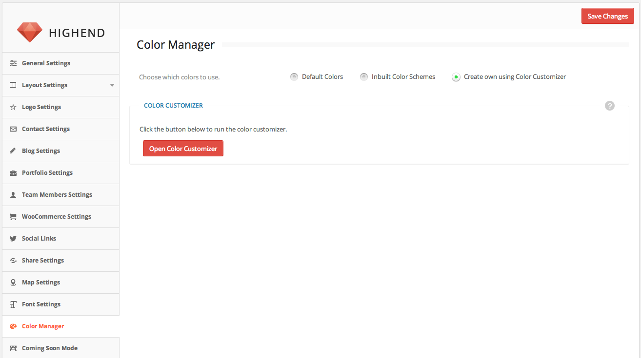
Live Color Customizer
The theme comes with a powerful tool - Live Color Customizer. This will allow you to change the colors of your website while live previewing it.
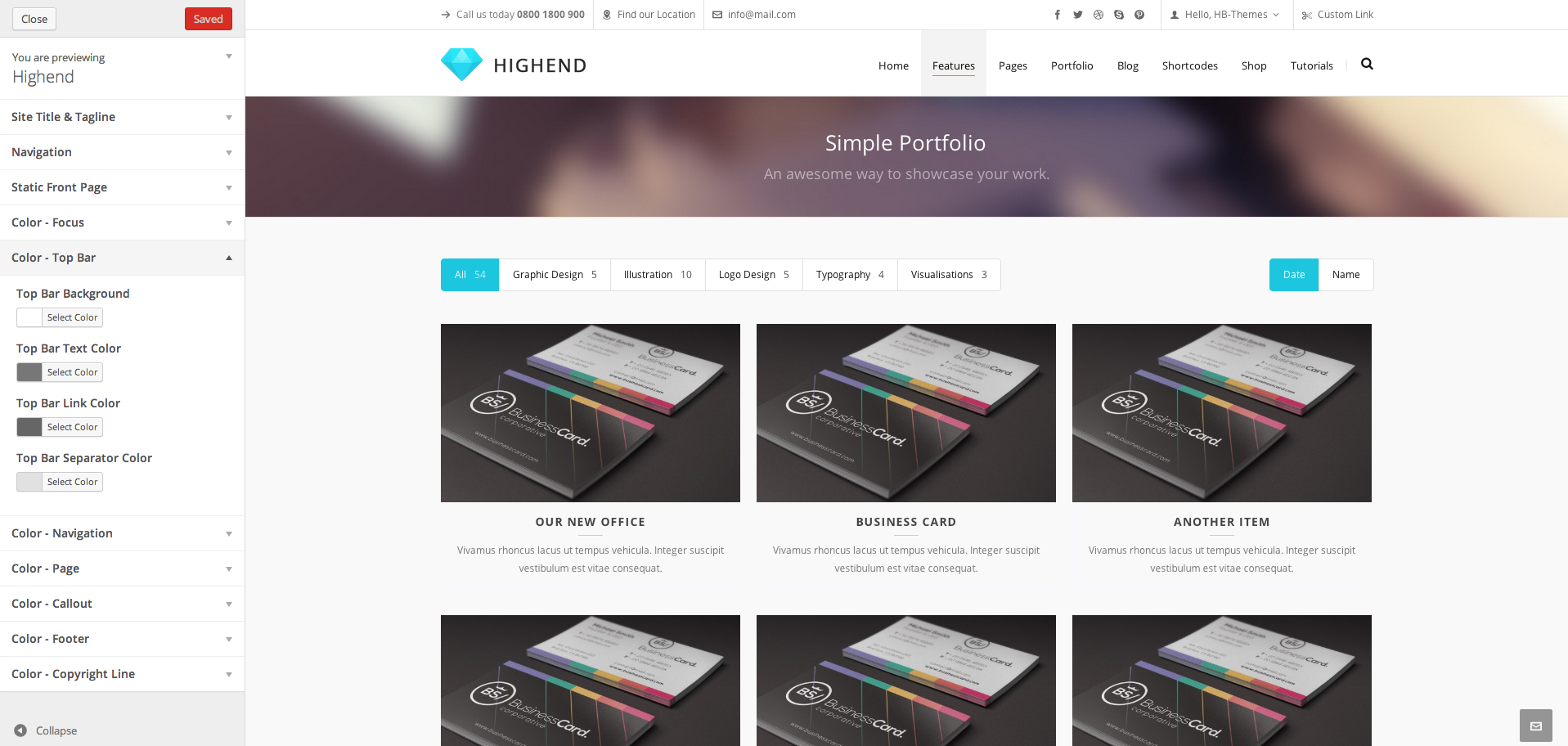
Make sure that "Create own using Color Customizer" option is checked in Highend Options > Color Manager.
Watch video tutorial
Features
Layer Slider
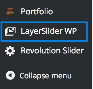
Highend theme includes the premium plugin - Layer Slider.
Once you've installed and activated the Layer Slider plugin (by going to Appearance > Install Plugins), you will then see the menu item appear at the bottom of the WordPress menu, as below:
Read plugin documentation
Features
Revolution Slider
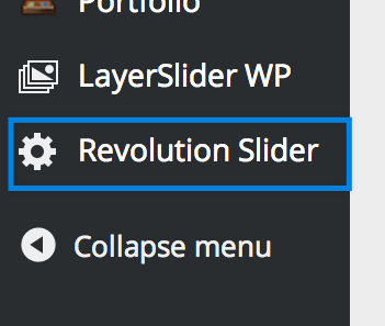
Highend theme includes the premium plugin - Revolution Slider.
Once you've installed and activated the Revolution Slider plugin (by going to Appearance > Install Plugins), you will then see the menu item appear at the bottom of the WordPress menu, as below:
Read plugin documentation
Features
Page Templates
Highend theme comes with 10 Stunning Custom Page Templates - extremely easy to use.
Each template has it's own set of custom meta settings which enables you to customize the pages even further. They are designed so that creating extraordinary pages and using showcasing your work is incredibly simple.
Included Page Templates:
- Blank Template
- Blog - Classic
- Blog - Fullwidth
- Blog - Grid
- Contact Template
- Gallery - Fullwidth
- Gallery - Standard
- Login Template
- Portfolio - Standard
- Portfolio - Simple
How to Use the Page Templates
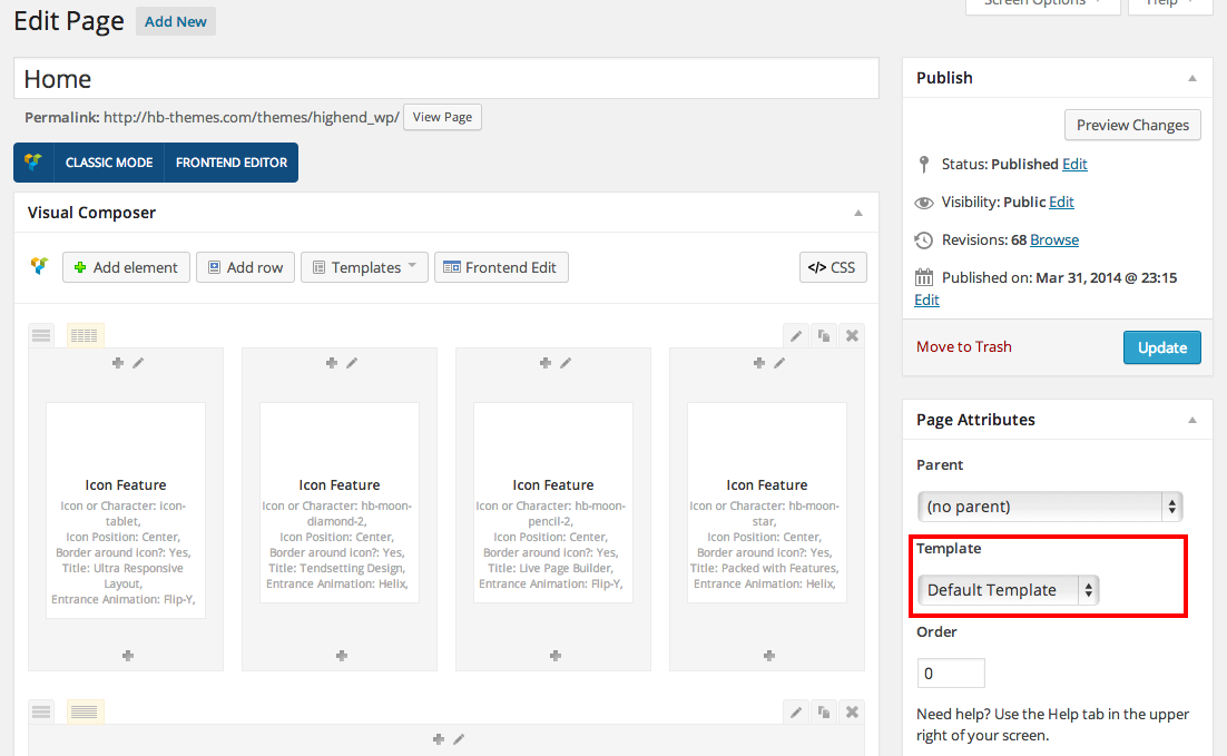
Step 1 - Click Pages > Add New (or Pages > My Page > Edit).
Step 2 - Select the desired template from Page Attributes > Templates.
Step 3 - Fill in additional Meta Settings. These fields will appear right below the content editor.
Step 4 - Fill in the page content.
Step 5 - Hit the Publish or Update button.
Page Template Advanced Description
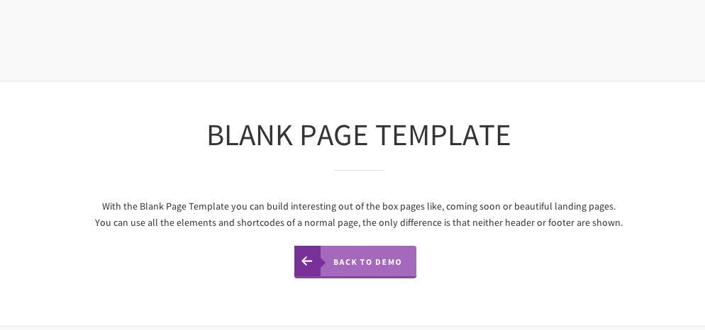
Blank Template
This is a simple and minimalistic template. Header and Footer are both disabled on this template which allows you to create gorgeus Landing, Coming Soon or Maintenance Pages.
Content of the Blank Template can be filled with anything, including all of our custom shortcodes.
Blog Classic Template
The Blog Classic Template offers a standard layout of the posts and their details, but still presented in a beautiful way, completely blending in with the rest of the theme.
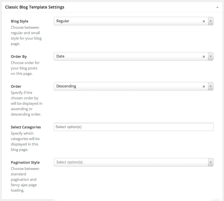
There are two versions of this Template. You can choose to display the Regular or Small Style in the Classic Blog Template Settings box, just below the content editor.
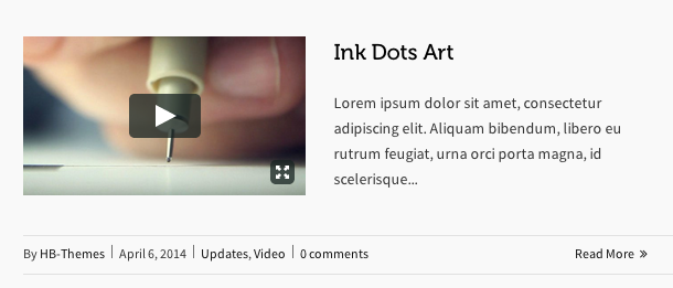
Regular style will display the post featured section (image, video, audio..) above the post details, stretching to fit the whole column.
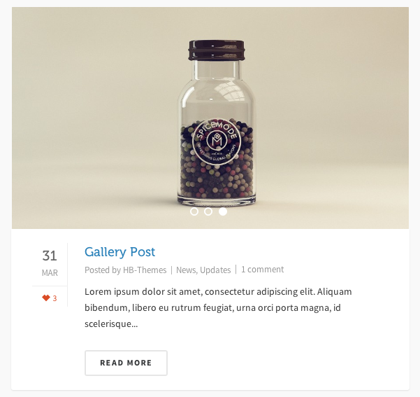
Small style will display the post featured section (image, video, audio..) aligned left, wrapped by the post details and content.
In the Classic Blog Template Settings, you are given the choice of order, category specification for posts and a decision between Standard and Ajax Load More Pagination style.
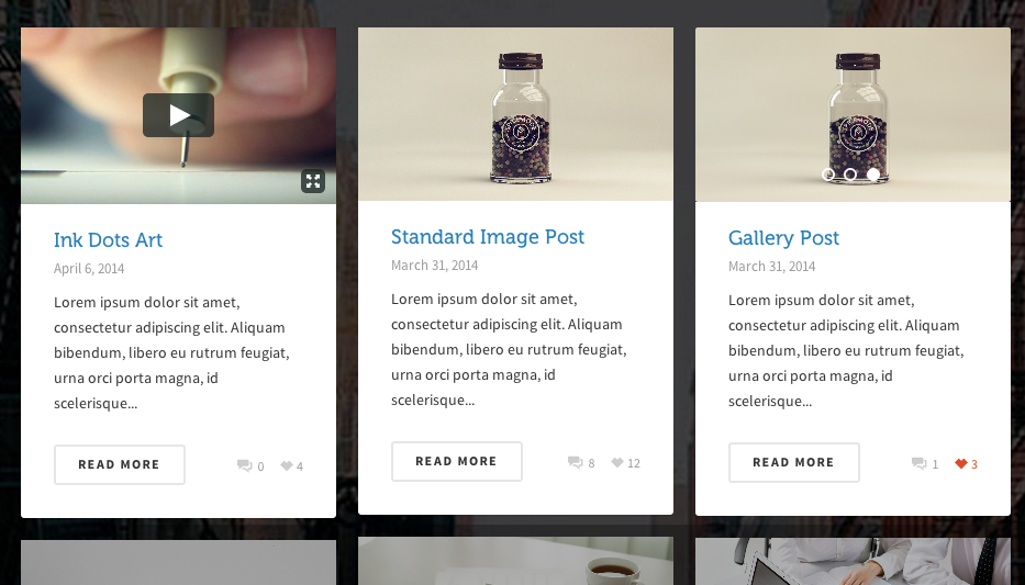
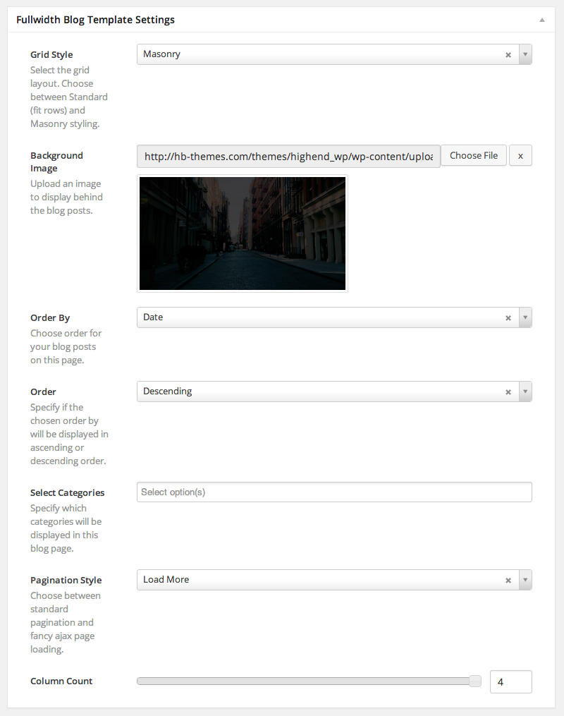
Blog Fullwidth Template
The Blog Fullwidth Template offers a unique Blog Layout. In a few words: Arranged in a grid, stretched to the maximum width your browser can reach, with varying column numbers.
There are also two versions of this template, one that sorts the post items in a standard way, clearing the space after the grid item row, and another, masonry style.
Both offer the same post design, the only difference is in the alignment of the items.
In the Fullwidth Blog Template Settings, you are given the choice of order, category specification for posts, column count, background image and a decision between Standard and Ajax Load More Pagination style.
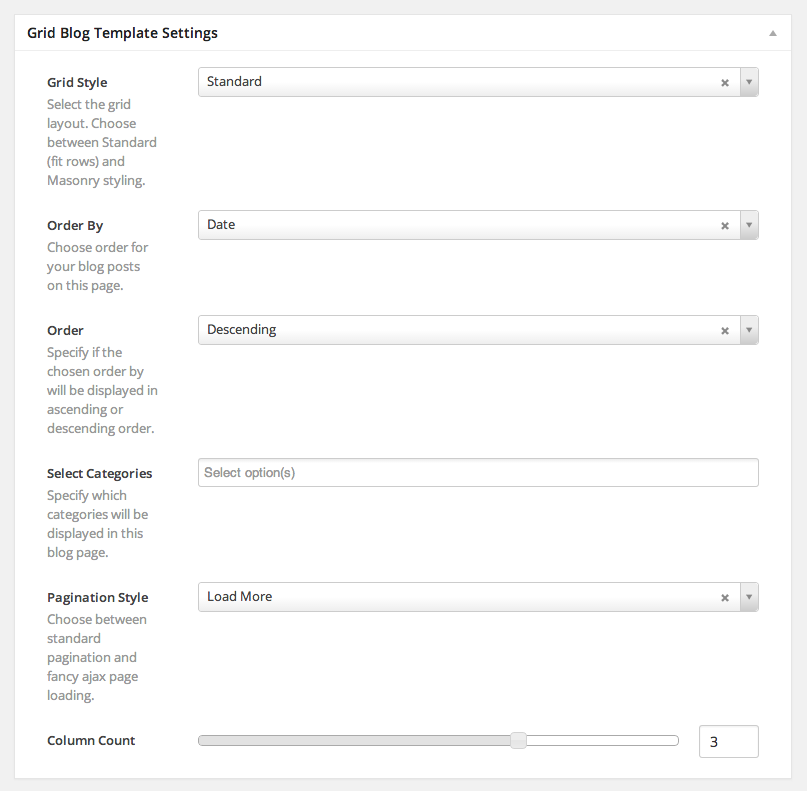
Blog Grid Template
The Blog Grid Template is a spectacular Blog Layout featuring blog posts arranged in a grid. Choose if the arrangement is masonry or standard style.
In the Grid Blog Template Settings, you are given the choice of order, category specification for posts, column count and a decision between Standard and Ajax Load More Pagination style.
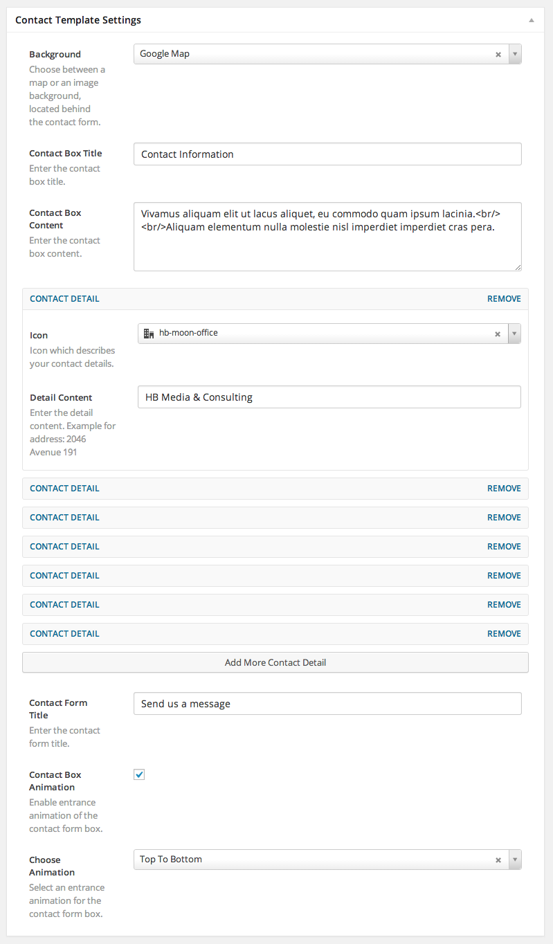
Contact Template
Highend includes a contact page with a built in contact form. The form is located in front of a background of your choice: map, image or simply nothing.
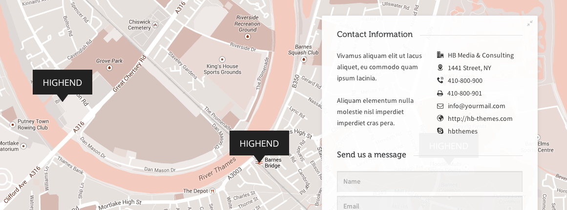
There is also an extensive set of options for the contact form area. FIll in as many contact details as you need and also add some cool effects to the page.
Gallery Fullwidth Template
Gallery pages will get you to showcase your work in album style. Assign multiple images to the Gallery Posts by following this tutorial.
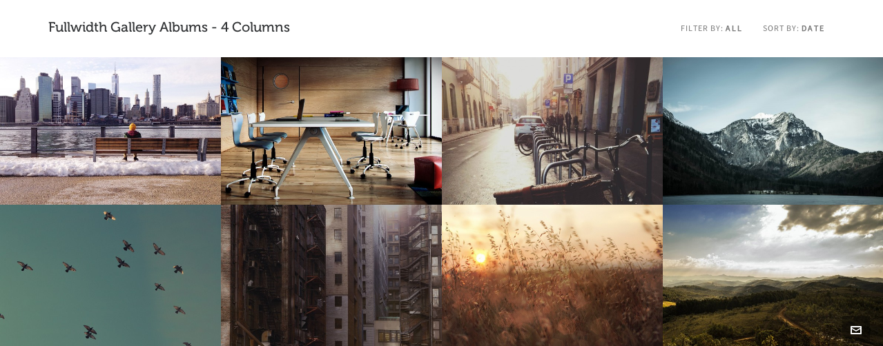
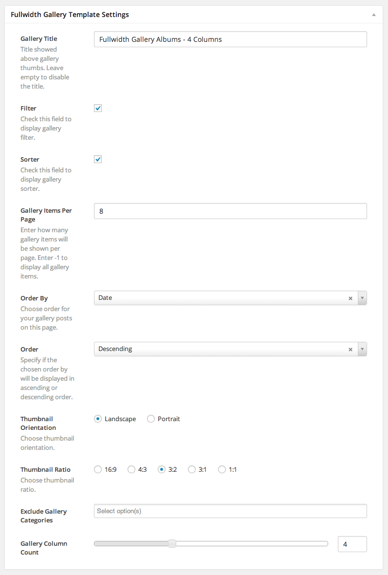
In the Fullwidth Gallery Template Settings, you are given the choice of order, category specification for gallery posts, column count, a decision of the gallery thumb aspect ratio and orientation and these are just some of the possibilites!
Gallery Standard Template
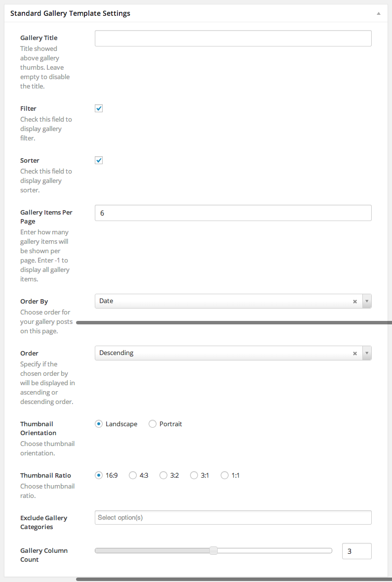
Gallery pages will get you to showcase your work in album style. Create some Gallery Posts, and assign multiple images to them by following this tutorial.
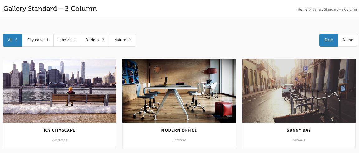
In the Standard Gallery Template Settings, you are given the choice of order, category specification for gallery posts, column count, a decision of the gallery thumb aspect ratio and orientation and these are just some of the possibilites!
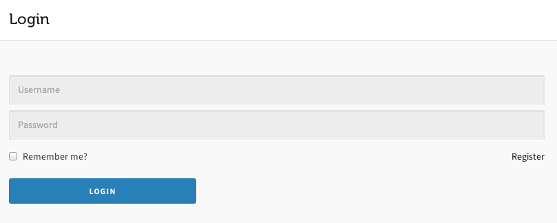
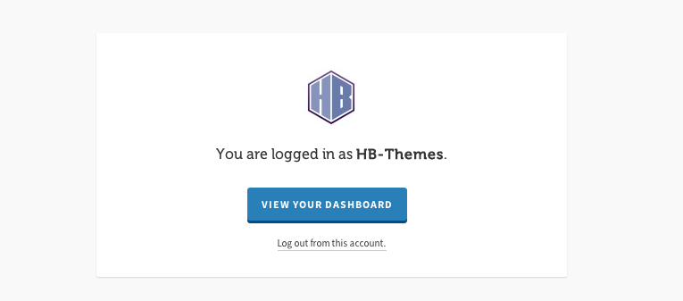
Login Template
This is a really simple template which features a beatiful login form for your users.
Once they are logged in, a neat Info Box appears with some user info and useful links.
Portfolio Standard Template
Highend includes advanced portfolio options that allows users to create as many portfolio pages as they wish. Each portfolio page you create can have a different set of categories, options, layouts and more.
You have to already have Categories setup in your Portfolio section for them to show up in the Portfolio Categroy list in the meta settings. Only the Categories you have made will show up. You also need to have the Categories assigned to Portfolio posts for them to show up on your site.
Portfolio Simple Template
Just as described in the Portfolio Standard Template, Highend offers advanced portflio pages. This time, this page is a bit simpler in it's style, excluding the portfolio details, showcasing only the featured image and the title.
Features
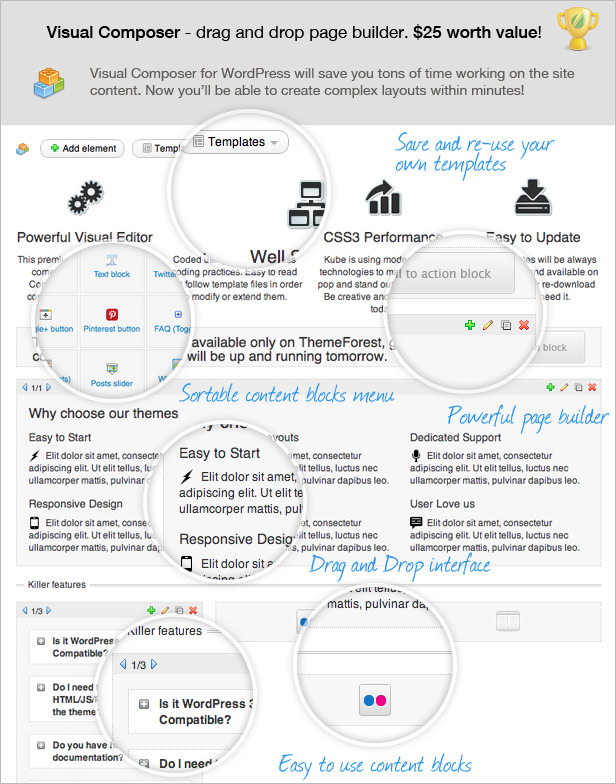
Visual Page Builder
Visual Composer is the #1 Selling Frontend and Backend Page Builder out there, you're in for a treat!
Build your content on the go with new WordPress frontend editing option. No more admin panel needed to create stunning and beautiful content blocks.
Visual Composer for WordPress is drag and drop frontend and backend page builder plugin that will save you tons of time working on the site content. You will be able to take full control over your WordPress site, build any layout you can imagine – no programming knowledge required. Moreover, now you can choose either work on a backend or move your page building process to frontend and instantly see changes you make.
Integrating over 50 custom designed shortcode elements, Highend raises the Visual Composer potential. Constructing the pages with the Drag & Drop Manager will cut your work time extremely short.
For Full Visual Composer Documentation visit the following:
Features
Highend Theme Options
The theme comes with an extensive Theme Options. You should take the time to go through all of these options to ensure that you are getting the most out of the theme. The Theme Options are located under Highend > Highend Options.
How To's
Set Up Page Title
The Page Title is a horizontal bar which is located just below the main menu. It can contain a Title and Subtitle with many different backgrounds and styles.
All posts and pages can have the bar displayed or hidden by default, and you can show or hide them also individually in the post meta settings.
Other than simply showing and hiding the bar, there are numerous options which are related to the position of the page title inside the bar, displaying the subtitle and customizing the background color or image.
The Highend Options contain global settings (or default settings) for the page title. These settings will applied on all new pages, pages which do not have custom settings and also the archive pages.
Set the Global Settings for the Page Title
Step 1 - Go to Highend > Highend Options > Layout Settings > Default Settings.
Step 2 - Choose if you want to Hide Page Title, show Page Title with Background Color or show Page Title with Background Image.
Step 3 - Depending on the type you chose to display (or not), you will be prompted to specify which color or image to will be placed behind the Title.
Step 4 - Set up the Title Style. Choose the position of the title in the bar, the style and height.
Step 5 - Set up optional Entrance Animations and you're all set.
Step 6 - To set the Breadcrumbs go to Highend > Highend Options > General Settings and Enable/Disable the Breadcrumbs.
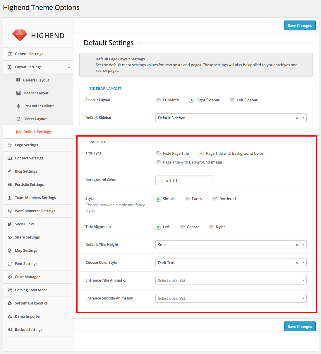
Set the Individual Page Title Settings per Post/Page
Step 1 - Open the page in the Admin Panel for editing.
Step 2 - Scroll down until you locate the General Settings.
Step 3 - Fill in custom Title or add a Subtitle. (Default title will be the WordPress Page title)
Step 4 - If you want to change the Default Settings from the Highend Options, change the Page Title Advanced Settings from Use Highend Options Settings to Custom.
Step 5 - A whole new box will open up where you are given the same set of options as there are in the Highend Options. Change any value These settings will apply to that page only.
Step 6 - Change the Breadcrumb Settings in the General Settings Box as well.
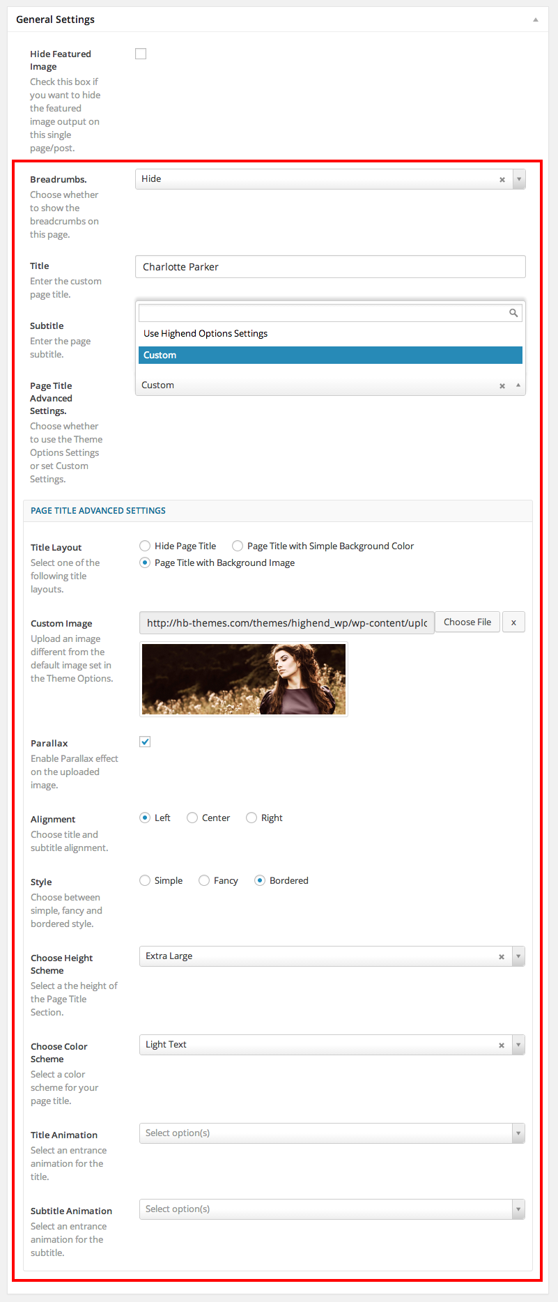
How To's
Set Up Featured Section
The Featured Section is a main part of every modern website. It's a section located just below the Page Title Bar, if shown, or under the Main Menu bar if hidden. It is a fully stretched section which can be assigned with an Image, Video, Revolution or Layer Slider.
Step 1 - Open the page in the Admin Panel for editing.
Step 2 - Scroll down until you locate the Featured Section Settings.
Step 3 - Choose what will be displayed in the section. Choose from: Featured Image, Revolution Slider, Layer Slider or Video.
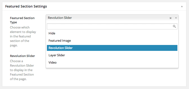
Step 4 - Depending on what you chose to display, you will be prompted another field so that you can specify exactly which Slider or Video to set in the section.
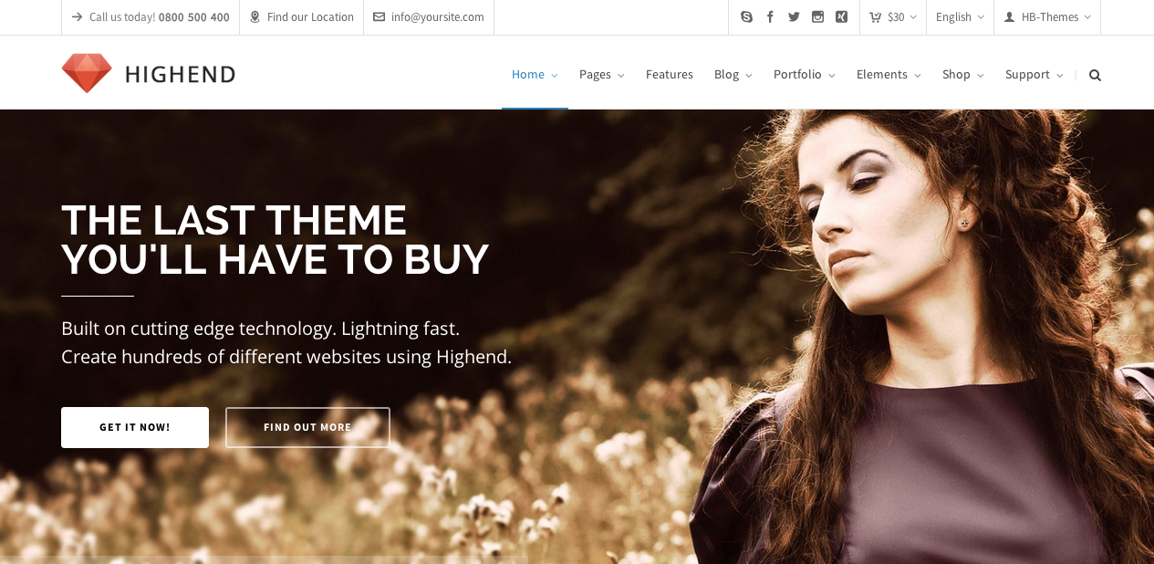
If there are no Revolution or Layer Sliders made, the prompted according field will be empty.
How To's
Set Up Footer
The Footer area is a section located at the bottom of your website. It includes a widget area and a copyright line, both of which are fully customizable.
There are Global Settings for both the widget and copyright are, and they are located in the Highend Options. These Global Settings will be applied to all new posts/pages, pages which do not have custom settings for the footer and archive pages.
Set the Global Settings for Footer Widget Area
Step 1 - Go to Highend > Highend Options > Layout Settings > Footer Layout.
Step 2 - Choose if you want to display the Footer Widgets by default.
Step 3 - If you choose to display them, you will be offered to choose a layout of the widgets. There are 11 layouts of the widgets in total.
Step 4 - Specify if you want to display the separator bars and a map image overlay of the footer area.
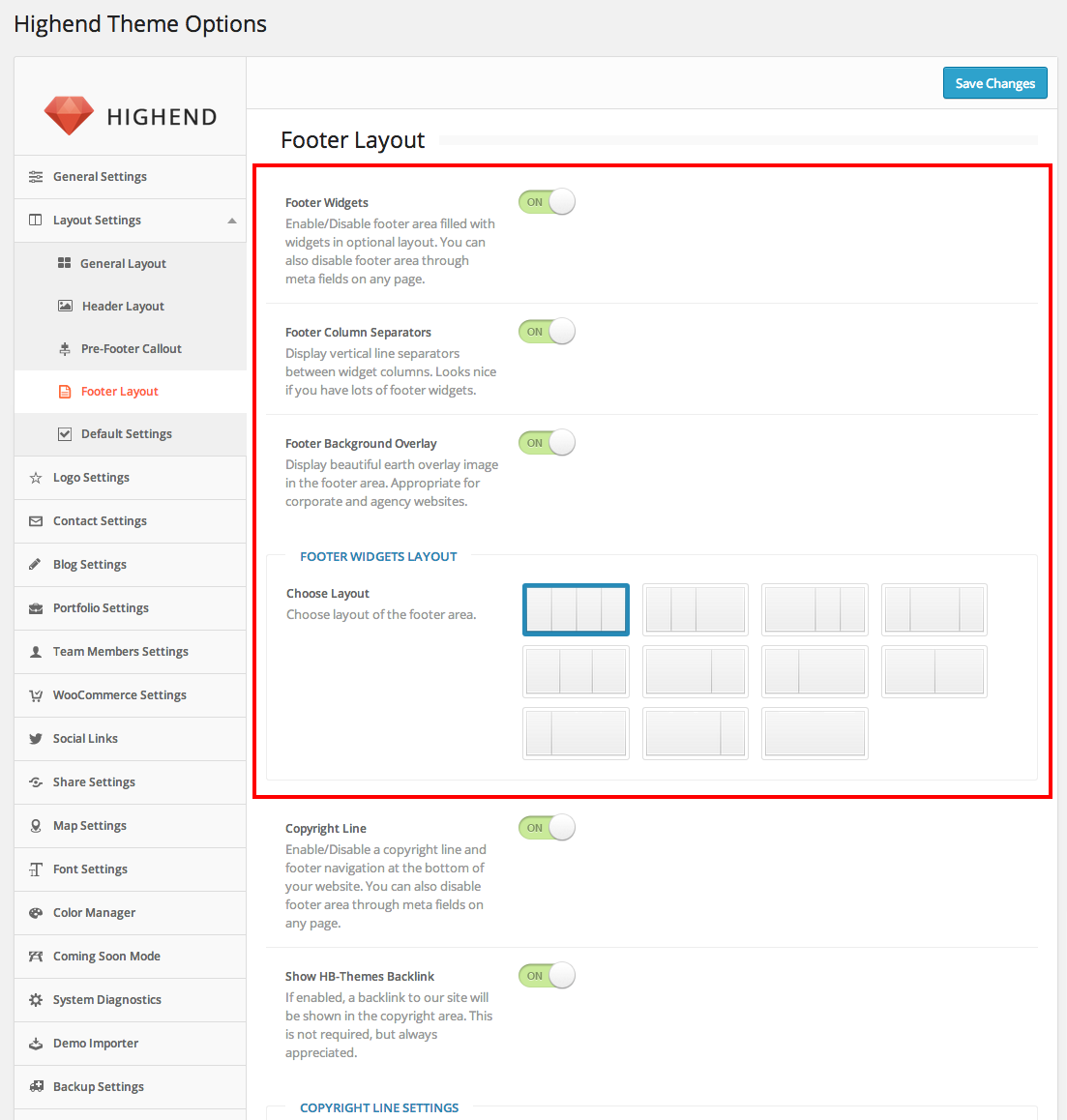
Step 5 - Once you get these settings, it's time to fill in the Widgeta are with Widgets.
Fill in Widget Areas with Widgets
Step 1 - Make sure that you have enabled the Footer Widget Area in the Highend Options as described above.
Step 2 - Navigate to Appearance > Widgets.
Step 3 - You should see 4 Widget Sections named Footer 1-4.
Step 4 - Depending on the layout, you should not fill all of them. If you have a 2 column layout, fill in only Footer 1 and Footer 2 area. Footer 1 is the first column and Footer 2 is the second.
Step 5 - Drag Widgets onto the desired Footer Areas and customize each widget.
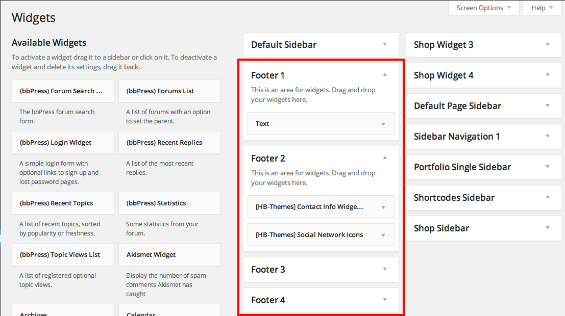
Set the Individual Post/Page Settings for Footer Widget Area
Step 1 - Open the page in the Admin Panel for editing.
Step 2 - On the right side of the page locate the Layout Settings.
Step 3 - Change the Footer Widgets setting from the default to show or hide.
Step 4 - Update the Post/Page.
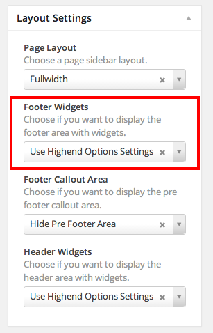
Set the Copyright Line
Step 1 - Go to Highend > Highend Options > Layout Settings > Footer Layout.
Step 2 - Choose if you want to display the Copyright Line.
Step 3 - If you've enabled the Copyright, fill in the Copyright content and all other options presented.
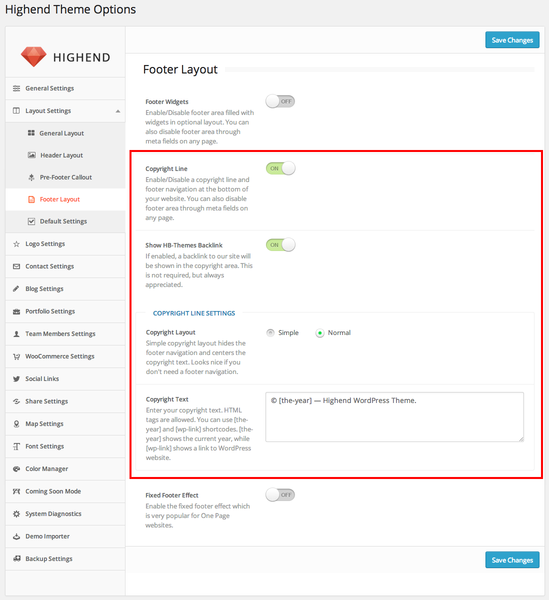
How To's
Set Up Forum - bbPress
Highend has full compatibility with the worldwide known Forum Software for WordPress - bbPress. Feel free to use all bbPress pages and widgets to get your forum in it's best shape possible.
To get started with the plugin, follow the basic step by step guides here:
How To's
Set Up Fullwidth Sections
Since Highend version 2.0 Fullwidth Section and One Page elements are deprecated.
Please use ROW element in Visual Composer instead.
Highend gives you the option to create fullwidth sections on your pages. This shortcode will break out of the container and allow your backgrounds to stretch all the way across the screen.
Inside of this shortcode you will find options to use a solid color of your choosing or upload an image or a video that will be used as the background. When using an image you also have the option to parallax the background which can come in handy for creating more interesting sections.
Creating the Fullwidth Sections is extremely easy, simply insert the fullwidth_section shortcode, via the Shortcode Generator or Visual Composer, in the page content and fill in the desired attributes.
The Fullwidth section shortcode contains padding and margin attributes which are crucial if you want to get the complete fullwidth experience. If you want to pull up your Fullwidth section to close an empty gap, simply insert a negative top margin value, or if you would like to close a gap below the section, simply insert a negative bottom margin value. Padding top and padding bottom will control how much space is there between the content and the top and bottom edges of the section.
Using the Frontend Live builder with this particular shortcode may cause some shortcode appearance issues. The content of the section is filled with other shortcode using the Shortcode Generator. Since this is the case, this way of nested shortcodes may cause Frontend Live Builder issues, such as duplicating and adding additional spaces on each update. Our recommendation is that you use the Backend Editor for these sections and there won't be any issues.
Watch a video tutorialHow To's
Set Up One Page
Highend Theme includes a super easy One Page Site feature. You do not have to create multiple pages in order to generate the One Page Site, you need to create only one and simply add sections to your page which will be linkable. This is a neat way to put all content on one page and the navigation will scroll directly to the according page section. Like a complete website, with all information on one page. Generating the page is simple as is the custom menu construction.
Generate One Page Sections
Step 1 - Navigate to Pages > Add New and fill in the page title.
Step 2 - Set this page to have the Default Template with Fullwidth Layout, no sidebars.
Step 3 - Fill in all other Custom Settings, such as the Featured Section, Page Title etc.
Step 4 - IMPORTANT: Make sure that Enable One Page Elements checkbox is checked. The field is located in a settings box named Misc Settings.
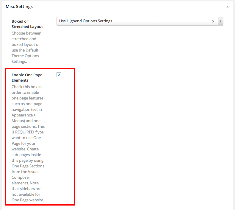
Step 5 - Generate One Page Sections via the Shortcode Generator or The Visual Composer.
Note: Since Highend 2.0 the One Page section shortode was deprecated so it is suggested that you use the Visual Composer. Please add a standard row and then enable the One Page option when you go to edit the row settings.
Step 6 - IMPORTANT: Add a Unique ID to each section. This ID is used for the Custom One Page Navigation. The ID should be a sanitized string. Example: my-page, one-page-section, first.
Step 7 - Fill in the one page section with any content you wish, similar to fullwidth sections.
Step 8 - Publish the page when finished.
Generate One Page Navigation
Step 1 - Navigate to Appearance > Menus and click Create a New Menu.
Step 2 - Open Link item, enter the URL, which is #one-page-section-id and the Title is of your choice. Press Add to Menu
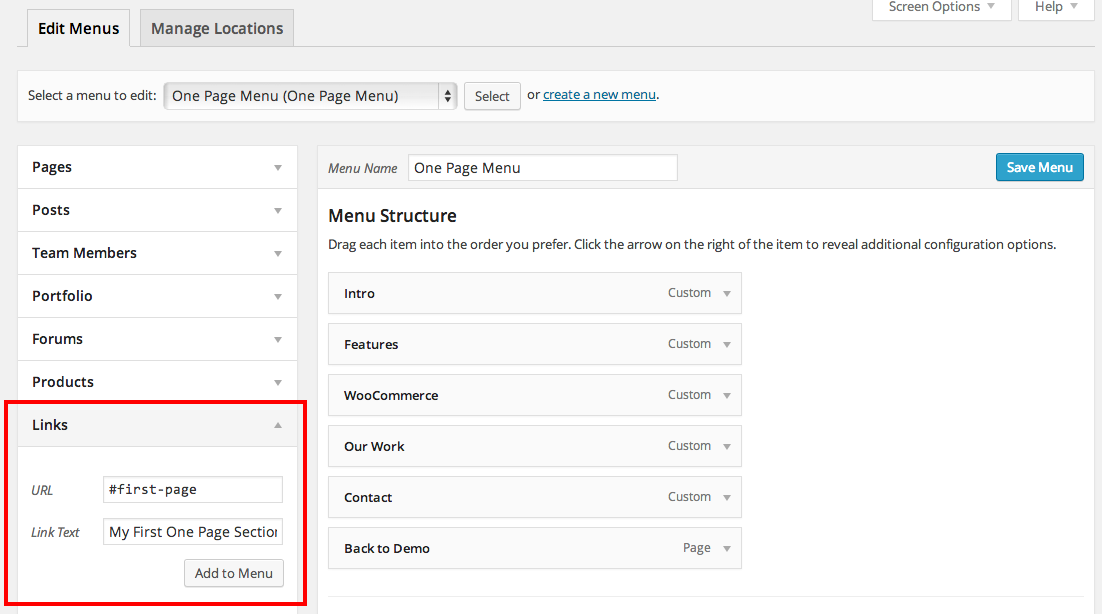
Step 3 - Drag and reorder these generated menu items, add icons to the items until you get the desired navigation layout. Save the Menu.
Step 4 - Go to Manage Locations and choose the previously created menu for the One Page Menu.
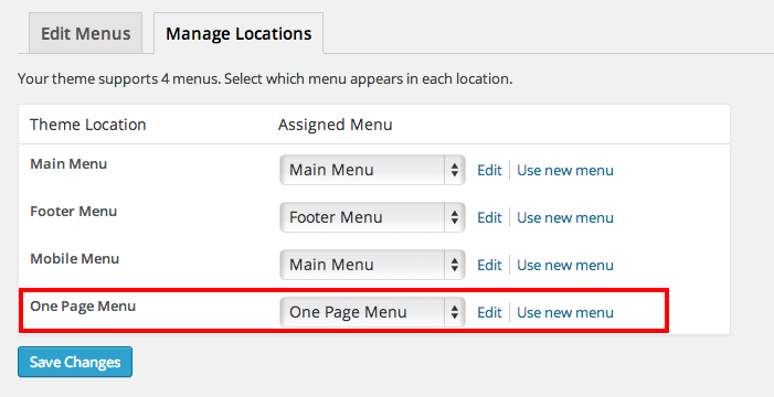
How To's
Set Up eShop - WooCommerce
Highend themes is 100% compatible with the WooCommerce plugin for WordPress. It includes full design integration of the WooCommerce pages, shortcodes and widgets.
For full documentation visit the following websites:
- WooCommerce Plugin Page
- WooCommerce Documentation
- WooCommerce Community Forums
- WooCommerce Builtin Shortcodes
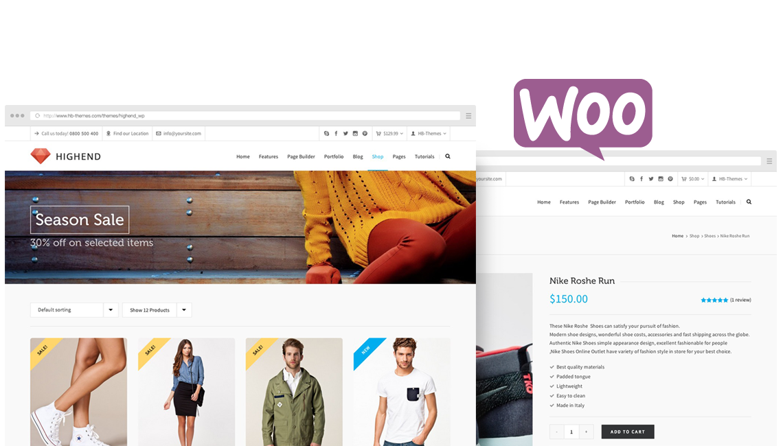
How To's
Set Up Sidebars
Sidebars are mandatory on every website, so we made sure that you have full control over them.
Highend allow you to generate unlimited number of sidebars. You can set each page with a different sidebar of your choice. Set each page with a different sidebar position as needed. Incredibly easy and awesome way to customize the pages with beatiful Widgets.
Generate Sidebars
Step 1 - Navigate to Appearance > Sidebar Manager.
Step 2 - Click the + Add New Sidebar button.
Step 3 - Provide a unique name for the newly created sidebar and hit OK.
Fill Sidebars with Widgets
Step 1 - Navigate to Appearance > Widgets.
Step 2 - You should see all Generated Sidebars there, ready to be filled with widgets.
Step 3 - Drag Widgets onto the desired Sidebar Areas and customize each widget.
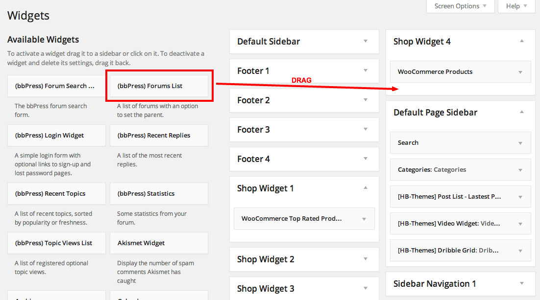
Global Sidebar Settings
Step 1 - Navigate to Highend > Highend Options > Layout Settings > Default Settings.
Step 2 - Set the a default Sidebar Layout for all pages unless otherwise specified.
Step 3 - Choose which Sidebar will be displayed if another one is not specified for a particular page.
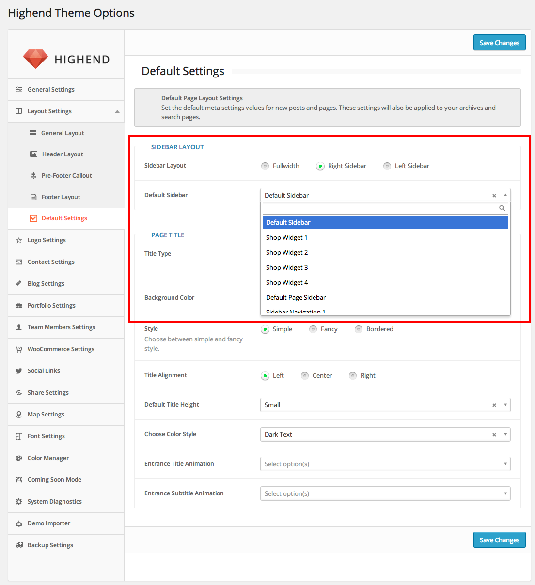
Individual Page/Post Sidebar Settings
Step 1 - Open the post / page in the Admin Panel for editing.
Step 2 - On the right side of the page locate the Layout Settings.
Step 3 - Choose the Page Layout first.
Step 4 - If you choose a layout with a sidebar, you will be offered an option to choose one of the generated sidebar.
Step 5 - Update the Post/Page.
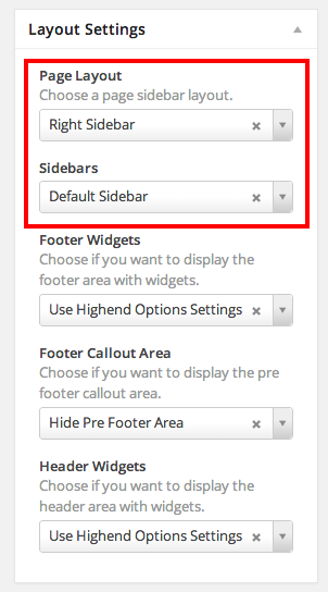
How To's
Set Up Coming Soon & Maintenance Page
Highend comes with a unique Coming Soon & Maintenance Page.
When you aren’t quite ready roll out with your site, but you want to get something up anyway, then the best option is usually an attractive coming soon page.
This Coming Soon / Maintenance Page will be displayed to all of your website visitors. Only logged in users will be able to see your website while you are still in the process of construction.
Step 1 - Go to Highend > Highend Options > Coming Soon Mode.
Step 2 - Slide the Under Construction Mode button to enable it.
Step 3 - Fill in the countdown settings and the maintenance content.
Step 4 - Upload a background image of your choice.
Step 5 - Save the Settings.
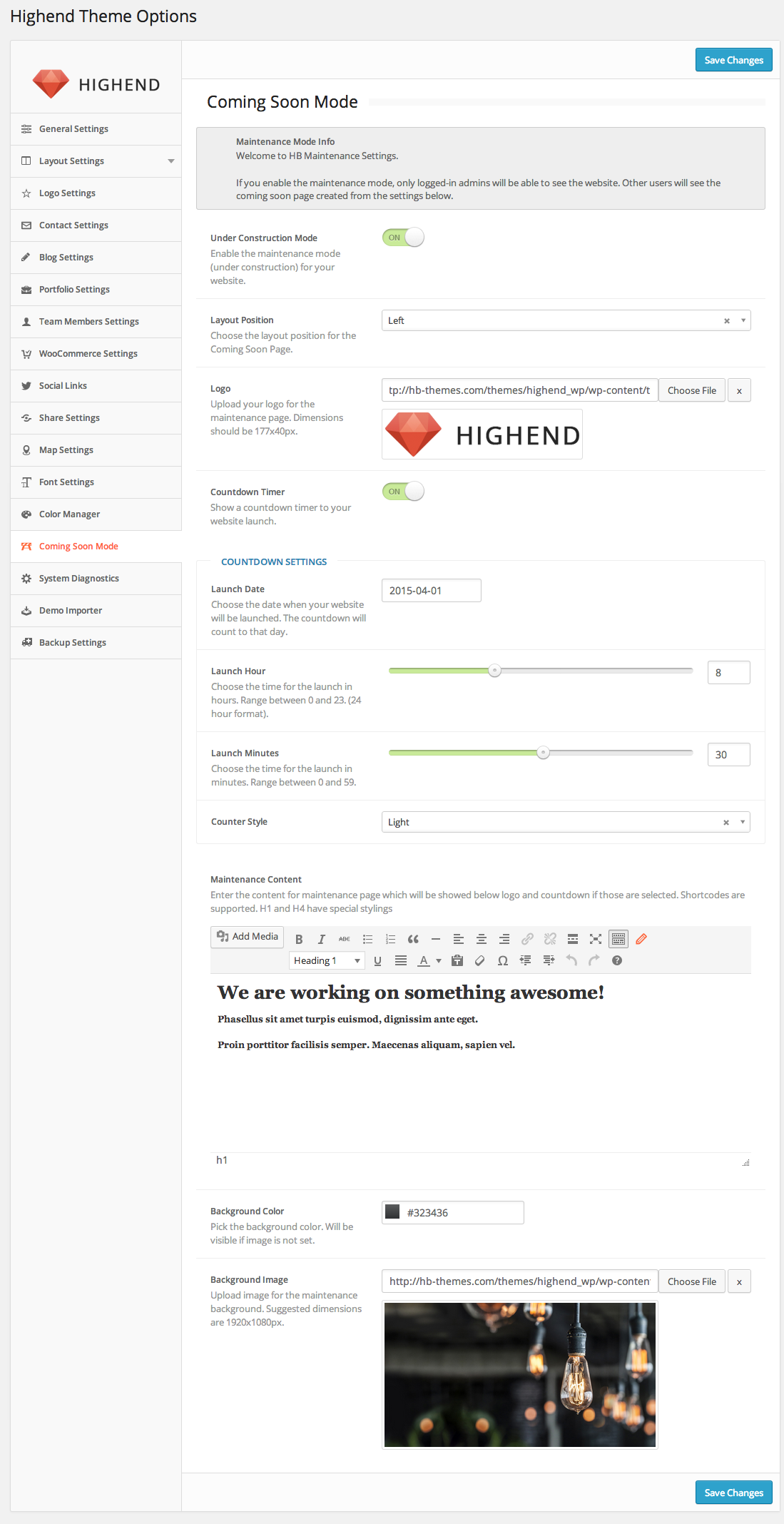
Features
Meta Settings
Highend theme is an ultra customizable theme which can be seen in individual Page Meta Settings.
In those settings, you are offered an extensive set of options which will allow you to customize each post, page, portfolio etc.
In the admin panel, when you open a page for editing, you will see several boxes, each box named after a group of fields which control similar aspects of the page.
Each Page Template or Post Format has its own additional set of fields. Those can be seen instantly, when a template or format is chosen in the admin panel. For example, Portfolio pages offer different customizations than the Blog pages.
Features
Font Options
The theme allows you to change font settings easily. You can choose between Default settings and Custom Google Web Fonts. If you are using Google Fonts, then all you need to do is select the type from the button set, and then select the font family from the provided dropdowns.
Useful
Twitter oAuth
To enable the use of Twitter widgets and shortcodes within Highend, you will need to follow a few steps:
Step 1 - Visit https://dev.twitter.com/apps/ and sign in using your Twitter username and password. This doesn’t have to be the username or password of the stream you need access to, just a Twitter account you control.
Step 2 - Select Create new application and enter the application details.
The name and description can be anything you like really, but you can’t use ‘Twitter’ in the name.
The website field can be your main website and doesn’t have to be the site where your Twitter feed or feeds are located.
Callback URL can be left blank.
Step 3 - Enter the CAPTCHA info and click create.
Step 4 - On the next details screen, click Create my Access Token. You may need to refresh the page after a few seconds if it doesn’t appear automatically.
Step 5 - Make a note of the API key, API secret, Access token and Access token secret as highlighted below.
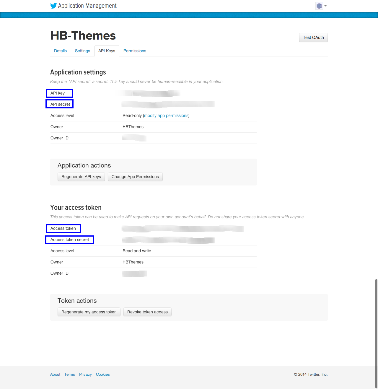
Step 6 - Login to your WordPress Dashboard and go to Highend > Highend Options > Social Links.
Step 7 - Enter the required info in Twitter API Settings.
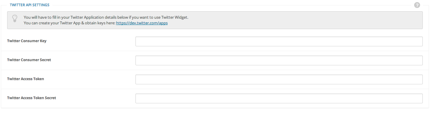
Step 8 - Save changes and you are ready to use Twitter features.
Useful
Page Imports
If you don't want to import all of the demo content, you can import individual pages. Below you can find individual pages on our demo that were made with shortcodes/ Visual Composer. Please note, some pages are created with Page Template and thus are not listed here. To create those pages, please refer to those individual sections of our documentation. Follow the steps below to import a page.
Step 1 - Open the demo content of the page you want to copy, then select the text and copy it.
Step 2 - Create a new page in your WordPress Dashboard (Pages > Add New), then fill in the details and metabox settings (settings below main editor).
Step 3 - Now, click on the TEXT tab (not the VISUAL tab) and paste the content into the field.
Step 4 - Change the editor mode to Backend Editor. You should now see Visual Composer Layouts for that page. (You need to have Visual Composer installed)
Step 5 - Publish the page and you’re done!
Please note that you need to change metabox settings in order to get exact page like the one on demo. (With same sidebar layout, title and more...)
Individual Page Exports
- Home - Shop
- More coming soon...
Features
Custom Post Types
Highend has 7 inbuilt custom post types + 2 more from the plugins (Revolution Slider and Layer Slider).
Following post types are included:
- Team Members - Your staff/employees or similar.
- Clients - Logo images of your clients or similar.
- FAQ - Frequently Asked Questions.
- Pricing Tables
- Testimonials - Testimonials from your clients or similar.
- Galleries - Image and Video Album Galleries.
- Portfolio - Showcase your work.
- LayerSlider WP - Popular Parallax Drag & Drop Slider.
- Revolution Slider - Another popular Drag & Drop Slider.
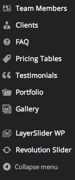
Features
Shortcode Generator
Shortcodes are a major part of every premium theme. They allow you to create advanced, complex and beautiful page sections fast and easy, with no programming skills required.
With the Shortcode Generator included, usage of the shortcodes becomes drastically easier. Using the advanced WordPress TinyMCE, we have enabled you to create shortcodes in a few clicks.
The Shortcode Generator contains all shortcodes and all possible options for each one of them.
How to Use the Shortcode Generator
Step 1 - Click Pages > Add New (or Pages > My Page > Edit).
Step 2 - Make sure that you are in the Classic Mode > Visual. (not using the Visual Composer Backend editor)
Step 3 - Click the Red Pencil named Highend Shortcode Generator.
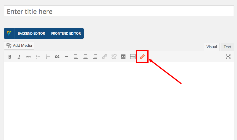
Step 4 - Choose a shortcode from the dropdown list of shortcodes.
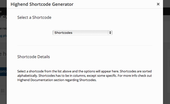
Step 5 - Fill in the offered options and hit the Insert button.
View the Shortcode Documentation
First Steps
Create Testimonials
Highend has inbuilt support for Testimonials Custom Post Type. You can use this post type to create testimonials from your customers or similar.
Adding Testimonials
Step 1 - Log in to your WordPress Administration Panel (Dashboard)..
Step 2 - Click the 'Testimonials' tab.
Step 3 - Click the 'Add Testimonial' sub-tab.
Step 4 - Start filling in the blanks: enter your testimonial title in the upper field, and enter the testimonial content in editing box below it.
Step 5 - As needed, select a category and fill in the meta setings below the editor.
Showing Testimonials
You need to use one of several Testimonial shortcodes/page-builder modules in order to list your Testimonials.
First Steps
Create FAQs
Highend has inbuilt support for Frequently Asked Questions (FAQ) Custom Post Type.
Adding FAQs
Step 1 - Log in to your WordPress Administration Panel (Dashboard)..
Step 2 - Click the 'FAQ' tab.
Step 3 - Click the 'Add New FAQ Item' sub-tab.
Step 4 - Start filling in the blanks: enter your faq item title in the upper field, and enter the body content in editing box below it.
Step 5 - As needed, select a category and fill in the meta setings below the editor.
Showing FAQ Items
You need to use one of several FAQ shortcodes/page-builder modules in order to list your FAQ items.
First Steps
Create Team Members
Highend has inbuilt support for Team Members Custom Post Type. You can use this post type to list your emloyees.
Adding Team Members
Step 1 - Log in to your WordPress Administration Panel (Dashboard)..
Step 2 - Click the 'Team Members' tab.
Step 3 - Click the 'Add New' sub-tab.
Step 4 - Start filling in the blanks: enter your team member name in the title in the upper field, and enter the team member description in the main post editing box below it.
Step 5 - As needed, select a category and fill in the meta setings below the editor. Meta sidebar is a cool feature.
Step 6 - A featured image will represent your team member's image.
Showing Team Members
You need to use one of several Team Members shortcodes/page-builder modules in order to list your team members.
First Steps
Create Galleries
Highend has inbuilt support for Gallery Custom Post Type. Use this post type to create amazing galleries.
Adding Galleries
Step 1 - Log in to your WordPress Administration Panel (Dashboard)..
Step 2 - Click the 'Gallery' tab.
Step 3 - Click the 'Add Gallery' sub-tab.
Step 4 - Start filling in the blanks: enter your post title in the upper field, and enter your post body content in the main post editing box below it.
Step 5 - As needed, select a category, add tags, fill in the meta setings below the editor.
Step 6 - It is important to upload a featured image for your post.
Showing Galleries
You need to use one of several Gallery Page Templates in order to list your gallery images.
Simply create a new page, select one of the Gallery Page Templates, fill in the meta settings and hit Publish. Several shortcodes are also available for you to use.
First Steps
Create Posts
There are eight custom post types in Highend theme.
Standard, Gallery, Image, Quote, Status, Video, Audio and Link.
Adding Posts
Step 1 - Log in to your WordPress Administration Panel (Dashboard)..
Step 2 - Click the 'Posts' tab.
Step 3 - Click the 'Add New' sub-tab.
Step 4 - Start filling in the blanks: enter your post title in the upper field, and enter your post body content in the main post editing box below it.
Step 5 - As needed, select a category, add tags, fill in the meta setings below the editor.
Step 6 - Select post format on the right hand side and fill in the meta settings below the editor.
Step 7 - It is important to upload a featured image for your post.
Showing Posts
You need to use one of several Blog Page Templates in order to list yours posts.
Simply create a new page, select one of the Blog Page Templates, fill in the meta settings and hit Publish.
First Steps
Create Portfolio
Highend has inbuilt support for Portfolio Custom Post Type. Use it to showcase your work.
Add Portfolio Items
Step 1 - Log in to your WordPress Administration Panel (Dashboard).
Step 2 - Click the 'Portfolio' tab.
Step 3 - Click the 'Add New Portfolio Item' sub-tab.
Step 4 - Start filling in the blanks: enter your portfolio title in the upper field, and enter your portfolio body content in the main post editing box below it.
Step 5 - As needed, select a category and fill in the meta setings below the editor. Category will be used as a filter on Portfolio Template pages.
Step 6 - It is important to upload a featured image for your portfolio item.
Showing Portfolio Items
You need to use one of several Portfolio Page Templates in order to list your portfolio posts.
Simply create a new page, select one of the Portfolio Page Templates, fill in the meta settings and hit Publish. A several shortcodes are also available for you to use.
Useful
Child Theme
Highend comes with a child theme. You can download it from this link.
Simply install the child theme like a regular WordPress theme.
What is a Child Theme?
A WordPress child theme is a theme that inherits the functionality of another theme, called the parent theme. Child theme allows you to modify, or add to the functionality of that parent theme. A child theme is the safest and easiest way to modify an existing theme, whether you want to make a few tiny changes or extensive changes. Instead of modifying the theme files directly, you can create a child theme and override within.
Why use a Child Theme?
If you modify an existing theme and it is updated, your changes will be lost. With a child theme, you can update the parent theme (which might be important for security or functionality) and still keep your changes. It can speed up development time. It’s a great way to get started if you are just learning WordPress theme development.
Additional Links
Useful
Disable Comments
Comments are enabled on WordPress by default. You can change this default for new posts or pages you’ll publish in the future, as well as change it for posts or pages you already published.
To change the defaults for new posts or pages, go to Settings → Discussion.
To disable comments on an existing post/page/project, open it up for editing. Now beneath the main content area, you should see a box labeled “Discussion”. Simply uncheck both boxes and save your changes.

What if you can’t see the discussion box?
Then you need to click the “Screen Options” tab in the upper right corner of your screen and check the box to enable the discussion module. You still need to close the tab and navigate to the bottom of the page and uncheck “Allow Comments” in the discussion module.

Useful
RTL Support
Highend is RTL ready and contains all the necessary styles.
To use RTL, you have to install RTL version of WordPress (arabic or hebrew version for example), have the proper language files (PO/MO) installed , and also specify the language in wp-config.php file.
Once you do that, your site will automatically be in RTL format. You can use RTL Tester for testing purposes.
Useful
List of Icons
Highend features over 1600 beautiful vector based icons. You can use them anywhere in the theme.
Icon preview is avaiable in the Theme Options, but if you want, you can also use our Highend Icon Preview App.
How To's
Change your homepage
Step 1 - Go to Settings > Reading in your WordPress Dashboard panel.
Step 2 - Set "Front page displays" to a "Static Page".
Step 3 - In the drop down menu for "Front Page" choose a page which will be your home page.
Step 4 - Leave the drop down menu for "Posts page" empty, as this is not used by the theme.
Step 5 - Save changes.
Watch a video tutorial
First Steps
Menu Setup
The theme uses WordPress built-in menus feature which can be found in Appearance > Menus. In this section we will explain how to use menus as well as some cool features we added to the menus, such as making a mega menu and using 1600+ icons for your menu items...
There are 3 pre-defined menu locations. Main Menu, Mobile Menu and Footer Menu.
Creating your menu
Step 1 - Login to the WordPress Dashboard.
Step 2 - From the 'Appearance' menu on the left-hand side of the Dashboard, select the 'Menus' option to bring up the Menu Editor.
Step 3 - Select Create a new menu at the top of the page.
Step 4 - Enter a name for your new menu in the Menu Name box.
Step 5 - Click the Create Menu button.
Your menu is now defined, and you can now add pages to it (steps below).
Adding pages to your menu
The Screen Options allow you to choose which items you can use to add to a menu. Certain items, like Posts are hidden by default. The Screen Options are located in the top right corner of your WordPress Dashboard.
Step 1 - Locate the pane entitled Pages.
Step 2 - Within this pane, select the View All link to bring up a list of all the currently published Pages on your site.
Step 3 - Select the Pages that you want to add by clicking the checkbox next to each Page's title.
Step 4 - Click the Add to Menu button located at the bottom of this pane to add your selection(s) to the menu that you created in the previous step.
Step 5 - Click the Save Menu button once you've added all the menu items you want.
Your custom menu has now been saved.
Assigning a Menu to a Location
Once you've created a menu and filled it with items, it's time to assign it to one of the theme pre-defined locations.
Step 1 - Go to Appearance > Menus and click Manage Locations.
Step 2 - Assign each Theme Location with a menu. You can assign menus to multiple Theme Locations.
Step 3 - Click the Save Changes button.
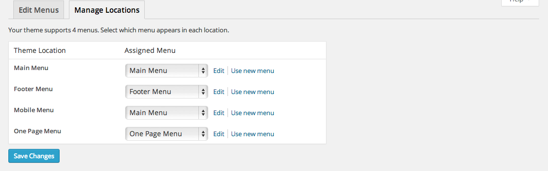
Mega Menu
Highend features Mega Menus. The mega menus are available only for top level navigations items only in "Main Menu" area.
Follow the steps below to create a mega menu:
Step 1 - Make sure that CSS Classes option is checked in the Discussion Box under "Show advanced menu properties" while you are in Appearance > Menus page in your WordPress Dasboard.
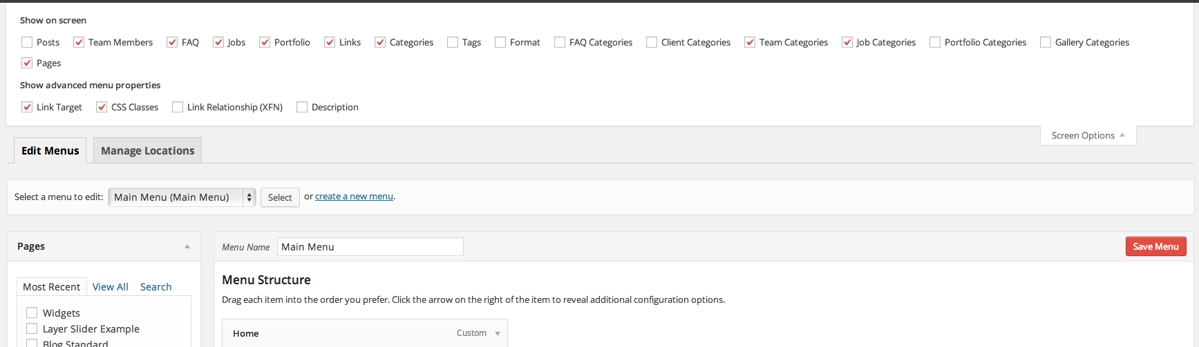
Step 2 - Now, add a an item to the menu editor. This has to be a top level item!
Step 3 - Click on arrow icon in the top right-hand and exapnd.
Step 4 - In the CSS Classes field add megamenu.
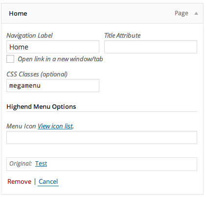
Step 5 - Now, you need to add child menu items, which will represent columns in the mega menu.First level of child items will represent Titles in each of 3 columns.
Add 3 sub child menu items, like on the image below.
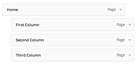
Step 6 - Now, add child items to each of those columns. This will represent your actual sub-menu pages. Take a look at the image below.
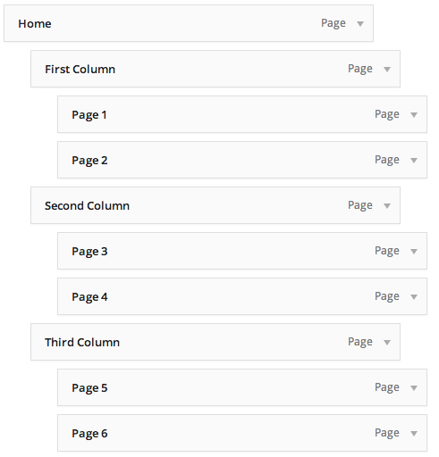
Your dropdown should now look something like this :
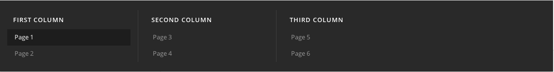
Notice that there is space for one more column.
If you'd like to use only 3 columns please take a look below at additional classes for Mega Menu.
Additional Classes for Mega Menu
There are several additional classes available for the mega menu. Simply add them next to the 'megamenu' class separated by one single space.
- columns-2 - Two columns in the mega menu.
- columns-3 - Three columns in the mega menu.
- columns-4 - Four columns in the mega menu. (Default)
- columns-5 - Five columns in the mega menu.
- columns-6 - Six columns in the mega menu.
- no-caption - Disable column titles in the mega menu.
So, if you, for example, would like a mega menu with 5 columns and without titles, you would enter your CSS Classes like this : megamenu columns-5 no-caption
Icons in Menu
When you add an item to the menu and expand it's settings, you will notice Highend Menu Options section there. In that section you will find a field where you need to enter an icon name if you want to use the icon. Please use our icon list app to get the name of any icon supported. Run the icon app.
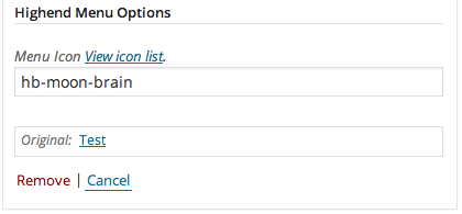
Watch video tutorial
First Steps
Upload your logo image
You can upload your logo image in the Highend Theme Options. If the logo is not uploaded, then your site name will be used.
Please, follow the steps below to upload your logo:
Step 1 - Login to your WordPress Dashboard.
Step 2 - Go to Highend > Highend Options > Logo Settings.
Step 3 - Upload your logo in any size - It will be resized to fit the header bar.
Step 4 - Upload your retina logo - exactly double the size of the regular logo.
Step 5 - Optionally, you can upload a Custom WordPress login logo.
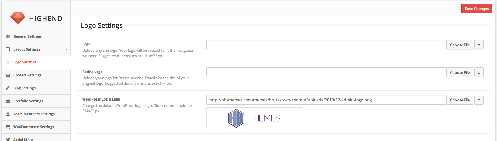 Watch a video overview of Theme Options
First Steps
Change Layout
Highend comes with three layouts: Boxed, Boxed Attached and Stretched layout.
Please, follow the steps below to find out how to change your layout:
Step 1 - Login to your WordPress Dashboard.
Step 2 - Go to Highend > Highend Options > Layout Settings > General Layout.
Step 3 - Choose between Boxed and Stretched layout and additional options will show up when you choose.
Step 4 - Optionally you can choose between two content width sizes: 940 and 1140 pixels.
Step 5 - Don't forget to save the changes.
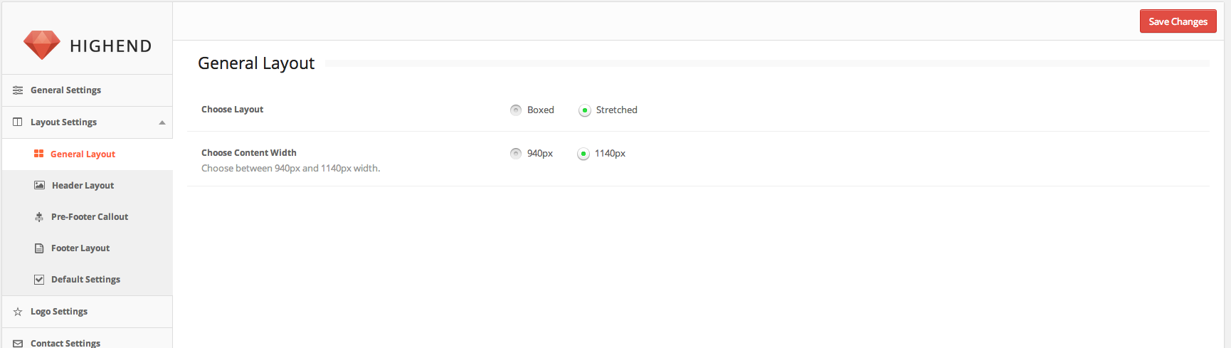 Watch a video overview of Theme Options
Introduction
Thank you for purchasing Highend WordPress Theme. Before you get started, please be sure to always check out these documentation files. We outline all kinds of good information, and provide you with all the details you need know to use Highend Theme.
If you are unable to find your answer here in the documentation, please search our Support Forum and watch our Video Tutorials. If you still can't find it, you can open a new topic on our Support Forum with all the details we need.
What is included with your purchase:
- Highend WordPress Theme
- Theme Updates (requires valid license)
- Theme Documentation
- Premium Plugins
- Premium Vector Font Icons
- Video Tutorials
- Premium Support (requires valid license) - Read our Support Policy.
Installation
WordPress Installation
This theme requires a working version of WordPress to be installed on your server. You should always run the latest version of WordPress. If you don't have a WordPress installed on your server, please follow the steps below to install it:
Step 1 - Go to WordPress.org and download the latest version of WordPress.
Step 2 - Create a database for WordPress on your web server and a MySQL user with all privileges for accessing and modifying the database.
Step 3 - Upload the WordPress files in the desired location on your web server.
Step 4 - Run the WordPress installation by accessing your website in a web browser.
Additional Links
Installation
Theme Installation via WordPress
Thank you for purchasing Highend theme!
Now, it's time to install your new theme. You can do that in 4 simple steps.
Step 1 - Download your Highend theme.
Step 2 - Log in to your WordPress Dashboard.
Step 3 - Upload your theme .zip file to WordPress.
Next - Import a demo & customize your site.
Troubleshoot - Common installation issues.
Download Your WordPress Theme
After purchasing the Highend theme, you will be redirected to the purchase confirmation page where you can download your Highend theme installation file.
Just click the "Download" button to the right and the theme installation file will start downloading. This file needs to be uploaded to WordPress in the next couple steps.
Log into your WordPress Dashboard
Log into your WordPress admin dashboard by typing in your domain name with /wp-admin added to the end. For example: yourdomain.com/wp-admin. Just note that if your WordPress installation is located in a sub-folder (like yourdomain.com/wordpress), you’ll need to add /wp-admin to the end of that.
If you are having trouble finding your WordPress Dashboard, feel free to contact your hosting provider support.
Once you’re there, login with the credentials you set up during the WordPress installation process.
After logging into your Dashboard, go to Appearance » Themes.
Upload your theme .zip file to WordPress
Next, you’ll need to upload the theme .zip file that you previously downloaded. The downloaded file will typically be located in your "Downloads" folder.
Click on the "Add New" button located at the top of the screen and then click the "Upload" button
Click "Choose File" and upload the theme installation .zip file.
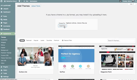
The file will upload and when it’s done you can click install. This won’t activate the theme on your site yet, it just installs the theme and makes it available on your WordPress site.
Once the installation is complete you can activate it by clicking the "Activate" link. The theme will go live on your site with default settings.
Note: If after downloading theme installation file you are seeing a folder instead of the .zip file, that means your browser automatically unzipped the downloaded file. You can either zip it again or disable the automatic unzip option from your browser settings.
Next steps
If you don't want to start building your website from scratch, you can import a pre-built demo website in a couple of clicks. Simply log into your WordPress Dashboard and go to Highend » Import Demo.
Highend theme comes with hundreds of options. You can access those options from your WordPress Dashboard » Highend » Highend Options.
Common Theme Installation Problems
Missing style.css stylesheet file
If you get an error saying that the stylesheet is missing, then you have uploaded the wrong folder. Please check that you have downloaded the Main File .
“Are you sure you want to do this?”
If you get the “Are you sure you want to do this” message when installing Highend via WordPress, it means you have an upload file size limit. Install the theme via FTP if this happens, or ask your hosting company to increase the limit.
Installation
Theme Installation via FTP
If you are going to install the theme using FTP, you will need an FTP Client, such as FileZilla.
Follow the steps below to install the theme via FTP:
Step 1 - Log into your hosting space (server) via FTP client.
Step 2 - Unzip the Highend theme installation file and you will find HighendWP folder.
Step 3 - Upload the HighendWP folder to your server in path .../wp-content/themes/.
Step 4 - The uploaded path should look like this: .../wp-content/themes/HighendWP/
Step 5 - Now, login to your WordPress Dashboard and go to Appearance > Themes and activate Highend Theme.
Step 6 - Most of the included plugins are integrated into the theme, but for some you will be prompted to install and activate.

Additional Links
Installation
Setting up the Demo Content
Automatic 1-Click Demo Importer
Setting up the demo content is super easy with our 1-Click Demo Importer.
Please, follow the steps below to import the demo data using the 1-Click Demo Importer:
Step 1 - Log into your WordPress Dashboard.
Step 2 - Go to Highend > Import Demo.
Step 3 - Choose a Demo and click the Import button to start the import process.
Step 4 - Wait until the process is done and the page is reloaded. This may take a while. Do not interrupt/cancel the import process!
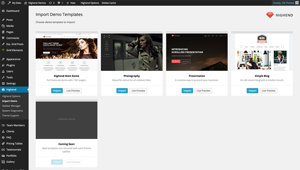 Watch a video tutorial
The importer should be run only once. If something went wrong and you need to import the content again, you may need to reset your WordPress.
Use this plugin to reset the WordPress database : http://wordpress.org/plugins/wordpress-database-reset/
Manual Demo Import
Some servers don’t support one click import. If you host your site on a sharing server or your server can’t handle the import traffic, one click import will fail. In this case follow these steps to perform manual demo import.
These steps are guidelines for a manual demo import. File names may vary depending on the Demo you are importing.
Import Media files, Pages and Posts
Step 1 - From your dashboard click on Tools -> Import -> WordPress and install WordPress Importer.
Step 2 - Click on Activate plugin & run importer.
Step 3 - Click browse and navigate to highend.xml.gz file from Demo Content folder (previously downloaded from mojo).
Step 4 - Click Upload file and import.
Step 5 - Check Download and import file attachments.
Step 6 - Click Submit.
Step 7 - Wait for All done have Fun! message.
Setup your Menu
Step 1 - Click on Appearance > Menus.
Step 2 - Switch to Manage Locations tab at the top of the page.
Step 3 - Set up your menus as described on the image bellow.
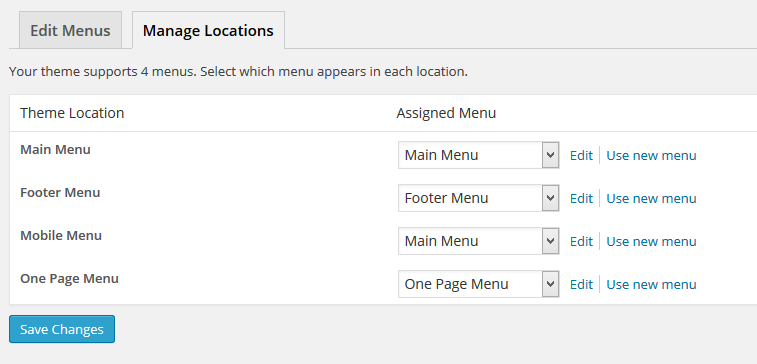
Setup your Homepage
Step 1 - Click on Settings > Reading.
Step 2 - Set Front page displays > A static page to Home as displayed bellow:.
Step 3 - Make sure that you leave the Posts Page to an empty field.
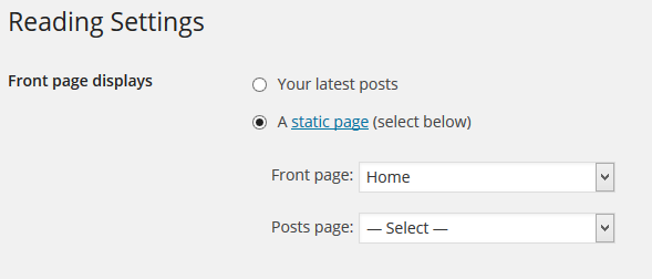
Highend Options Import
Step 1 - Navigate to Highend Options > Backup Settings.
Step 2 - Copy and paste the content from theme_options.txt file into Highend Options > Backup Settings > Import.
Step 3 - Click Import. The page will be reloaded shortly.
Revolution Slider Import
Step 1 - Click on Revolution Slider tab in your dashboard.
Step 2 - Click on Import Slider button and navigate to Revolution Slider Exports.
Step 3 - Import all exported .zip sliders one by one.
Widgets Import
Step 1 - Click on Plugins > Add New.
Step 2 - Search for Widget Settings Importer/Exporter plugin by Voce Platforms or download it manually from here: https://wordpress.org/plugins/widget-settings-importexport.
Step 3 - Go to Tools > Widget Settings Import.
Step 4 - Select widgets.json file from Widget Exports folder (previously downloaded from mojo).
Step 5 - Click on Show Widget Settings.
Step 6 - Click on Select All Active Widgets.
Step 7 - Click Import Widget Settings.
Useful
Automatic Theme Updates
Highend comes with an Automatic Theme Updater. No more worries when you have to update your Premium WordPress Theme. Simply go to Appearance > Themes and check if there's a "New Update" available for the Highend Theme.
We will post a tweet on our Twitter and Facebook when we release an update.
Follow us on Twitter to stay tuned!
Follow us on Facebook to stay tuned!
Useful
Additional CSS Classes
Every shortcode element has optional class attribute. You can use that attribute to specify your own class or you can use some of the predefined classes for various purposes.
Inbuilt CSS Class:
| Class Name | Description |
|---|---|
| hb-aligncenter | Very useful. Align element to the center. |
| alignleft | Align text to the left. |
| alignright | Align text to the right. |
| nbm | Removes bottom margin of the element. |
| ntm | Removes top margin of the element. |
| nlm | Removes left margin of the element. |
| nrm | Removes right margin of the element. |
| float-left | Float element to the left. |
| float-right | Float element to the right. |
| hidden | Hide the element. |
| hb-animate-element fade-in | Animate the element with fade in effect. |
| hb-animate-element left-to-right | Animate the element with left to right effect. |
| hb-animate-element right-to-left | Animate the element with right to left effect. |
| hb-animate-element top-to-bottom | Animate the element with top to bottom in effect. |
| hb-animate-element bottom-to-top | Animate the element with bottom to top effect. |
| hb-animate-element flip-x | Animate the element with flip-x effect. |
| hb-animate-element flip-y | Animate the element with flip y effect. |
| hb-animate-element helix | Animate the element with helix effect. |
Useful
Theme Update via WordPress
Updating the theme via WordPress is very similar to the install process via WordPress.
Follow the steps below to update your theme via WordPress:
Step 1 - Log into your WordPress Dashboard.
Step 2 - Go to Appearance > Themes.
Step 3 - Deactivate the Highend Theme by simply activating a different theme. Once you activate a different theme, you can delete the Highend theme.
Step 4 - Delete the Highend Theme. Do not worry, your content will not be lost!
Step 5 - Then simply upload the new “HighendWP.zip” file in the Appearance > Themes section. Click on the Install Themes tab at the top and choose to upload the zip file. You have this step explained in section: Theme Installation via WordPress.
Useful
Theme Update via FTP
Updating the theme via FTP is very similar to the install process via FTP.
Follow the steps below to update your theme via FTP:
Step 1 - Go to .../wp-content > themes location on your server using a FTP client and backup your "Highend" theme folder by saving it to your computer, or you can choose to simply delete it. Your content will not be lost.
Step 2 - Download the new version of Highend theme from your MOJO Account and retrieve HighendWP folder by unpacking the zip that you download from MOJO and HighendWP.zip.
Step 3 - Then simply drag and drop the new "Highend" theme folder into .../wp-content > themes location. Choose to “Replace” the current one if you did not delete it.
Step 4 - Log into your WordPress Dashboard, go to Appearance > Themes and activate the new Highend theme.
Installation
Translating the Theme
Highend is localized and you can easily translate it to any language you like. The steps below show how you can do that.
Step 1 - Before translating your theme, you’ll need to make sure WordPress is setup correctly with your locale. Open wp-config.php and modify the line below, or add it if it is missing. See the complete list of language codes and country codes to find your exact locale. You can also follow the steps from above.
$locale = 'en_US'; If you enter locale from already translated languages, then, that translation will be used. See above.
Step 2 - Now you’re ready to translate your theme. Now, you need to create po/mo files for your language and place them in languages folder. You can do that using PoEdit program. Another way to do this is by installing the Codestyling Localization plugin. Install and activate the plugin and go to Tools > Localization (shown in your language), then follow the instructions on how to translate the theme.
Handling Theme Updates
If you update your theme to a new version which has an updated language file, you’ll need to rescan your theme using the plugin and then translate the new strings. Find your theme in Codestyling Localization plugin and click the Rescan link to have the plugin update the pot file.
After you have rescanned your theme, click Edit to translate any new strings the plugin found when rescanning. Remember to generate a new MO file after you have translated your new strings.
If you have used PoEdit to generate po/mo files, make sure to backup those files before updating or the files will be lost.
Send us your translation!
If you translate Highend into a language that isn't included, then we'd really appreciate it if you could send it to us. It will be helpful to other users and also you wouldn't have to worry about theme updates. We will give you credits for the translation on our theme description page. Thanks!
Send us your translationUseful
Speed Optimization
Website loading speed is one of the most important things about your website. Highend has a great framework behind it, but you can follow these steps to supercharge your website and boost your Search Engine rank. Better rank means more visitors which means better business! Visit the additional links for even more tips.
The suggestions are ordered by priority, some of them are not free (marked with icon).
- Get VPS or even Dedicated Hosting Server. We recommend Bluehost.
- Get CDN (Content Delivery Network). We recommend MaxCDN or CloudFlare.
- Install a Cache Plugin for WordPress. We recommend W3 Total Cache.
- Install an Image Compress Plugin. We recommend EWWW Image Optimizer.
- Install a Database Optimizer Plugin We recommend WP Optimize
- Reduce the number of posts on the page
- Reduce the number of unnecessary plugins.
- Use more icons and less images.
- User smaller images. Don't upload images wider than 1920px.
- Keep in minimal! Use less shortcodes and Visual Composer elements.
Additional Links
WordPress Speed Up - by Yoast
15 Easy Ways To Speed Up WordPress
Dramatically Improve Your WordPress Loading
21 Ways to make WordPress faster
11 Ways to make your WordPress site faster and leaner
Video Tutorials
Plugin Video Tutorals
Essential Grid Video TutorialsRevolution Slider Video Tutorials
Visual Composer Video Tutorials
Layer Slider Documentation
Credits
The following resources have been used in the theme:
- Vafpres Framework - Powerful, extensible, yet easy to use Theme Options Framework.
- Bootstrap - The most popular front-end framework for developing responsive, mobile first projects on the web.
- Revolution Slider - The top selling slider plugin.
- Layer Slider 5 - Another top selling slider plugin.
- FontAwesome - The iconic font designed for Bootstrap.
- FlexSlider - The best responsive slider. Period.
- NiceScroll - Fancy Scrolling.
- Isotope - An exquisite jQuery plugin for magical layouts.
- FitVids - A lightweight, easy-to-use jQuery plugin for fluid width video embeds.
- Waypoints - Execute a function whenever you scroll to an element.
- MediaElement - HTML5 audio and video made easy. One file. Any browser. Same UI.
- IcoMoon - Custom Built and Crisp Icon Fonts, Done Right.
- Easing - A jQuery plugin to give advanced easing options.
- PrettyPhoto - A jQuery lightbox plugin.
- Google WebFonts - Amazing Web Fonts.
Many thanks to the authors.
Changelog
Read the changelog here.Features
Widgets
Highend theme comes with 20 Beautiful Custom Widgets - which are very easy to use.
Access them by going to Appearance > Widgets in your WordPress Dashboard.
Included Widgets:
- Advertisement Image
- Contact Info
- Dribbble Grid
- Flickr Grid
- Instagram Grid
- Pinterest Grid
- Facebook Box
- Google+ Box
- Portfolio Grid
- Latest Tweets
- Most Liked Portfolio
- Most Liked Posts
- Latest Posts
- Most Commented Posts
- Social Icons
- Recent Comments
- Testimonials
- Latest Posts
- Video Widget
- Google Maps